
)


)

At TrueLayer, we’ve been opening up finance since 2017. In the process, we’ve learned a thing or two about what drives your users to connect their bank account, as part of an open banking flow. In this article, we cover some of our top tips for improving the user experience in your app — whether it’s Account Information Services (AIS), Payment Initiation Services (PIS) or both — to increase your conversion rates and make your users even happier.
Before we get started, let’s clarify what we’re talking about in this article.
Open banking flow. What’s that?
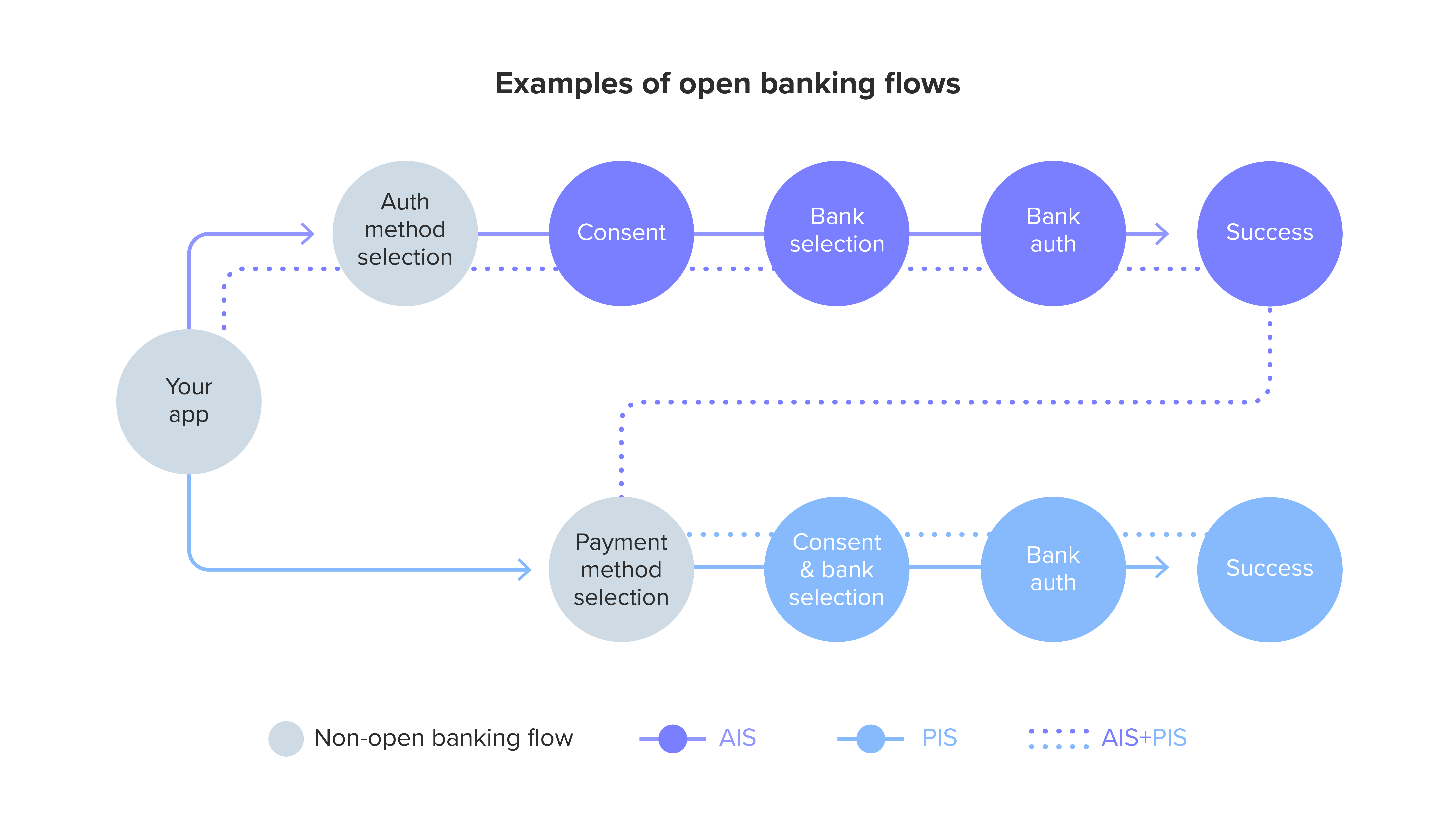
By open banking flow, we are referring to a portion of your overall flow. Specifically: from the moment a user selects an open banking method to either connect their account (AIS) or make a payment (PIS), until the completion of that journey.

)
Completion rate? Conversion rate?
When we talk about completion rate or conversion rate, we are referring to the percentage of users that successfully connect their bank account, make a payment, or both.
What results can you expect to see by following the suggestions in this guide?
A/B testing and client implementations have seen conversion rates increased by up to 23%.
All clear? Good! Now let’s identify the scenario that best describes your use case before we dig into the best practices to improve your flow.
📥 Too much reading? View our visual guide instead.
Scenarios and user motivation
What does your app do? Is it a marketplace? A PFM app? An online casino? Whatever the industry, chances are it will fit into one of the following use cases:
PIS only: top-ups / bank-to-bank transfer / digital wallets
AIS only: identity verification / account aggregation
AIS + PIS: a little bit of both
When it comes to new technologies, hard data shows that both demographics and use case (the actual reason why a user is doing something) play a vital role in completing a flow. We’ll refer to these as the user’s motivation. So what motivates a user to finish the flow? What’s their reward? Well, it depends!
To understand what we’re talking about, let’s look at two examples.
Think about the motivation someone has to request a loan to buy their first house, compared to someone who wants to put aside some cash for a holiday. One is requesting money, the other simply thinking about saving money. The loanee is taking an action: requesting a big chunk of money for what is a life-changing decision. The saver is considering doing something but hasn’t made any commitments yet.
These different motivations cause different user behaviours.

)

When looking to optimise your user’s open banking journey, it is vital that you understand their motivation. So your first port of call should be to build user personas. Really dig deep into the reasons why a user uses your app, and try to understand their emotional and rational states. This will help you empathise with your users and discover how you can better serve them.
Next, you need to ask yourself: how often will my user go through this flow? Is it a one-time-only deal, or is it something that they might repeat multiple times every month?
First-time user vs returning users
Whether your user passes through the flow multiple times, or just once, plays a big role in how your journey should be designed. The reason, once more, comes down to your user’s motivation.
In the world of AIS, think about first-time consent vs re-consent. Or with PIS, think account top-ups. Once the user has been through the journey, they’ve already answered most of the key questions you needed to ask them. So avoid causing frustration by asking them the same questions all over again.
The design of a first-time user flow vs a returning user flow should be different. We’ll explain how in the next section.
Best practices
Through our research, we have identified four major principles that will help you improve your conversion rate. They are:
💡 avoid ambiguity
👀 be transparent
☝️ use common patterns and shortcuts
✏️ simplify complexities
Now let’s translate these into what the user actually wants:
to follow a journey that is familiar
to clearly understand what they are doing
to perform actions that make sense
to read only what they want to read
The above points are all true whatever your scenario is (AIS, PIS, both). However, some are more relevant to first-time users (1,2,4), while others are more relevant to returning users (1,3).
1) 💡Avoid ambiguity: users like familiarity
If you are a TrueLayer customer, you are either using our user interface (UI) or have created a custom flow for your app. Either way, it will look something like this:

)

Suddenly entering a different UI and being redirected to something outside of your brand experience can break trust. But not always. If the external UI has already been optimised for conversion, or (better yet) is already known and trusted by the user, it can actually convert better.
)

To reduce ambiguity and create a more familiar journey, there are two key points you need to focus on:
branding your UI
avoiding content duplication
Branding your UI
Creating a consistent brand experience across the entire user journey is less disruptive and converts better than introducing a non-branded UI. To do this you’ll need to opt for a fully white-labelled solution, and design and build your own bank selection and consent pages.

)

Alternatively, you can use the TrueLayer flow to save time and go live with your product right away. For Data, you can easily customise the UI, its colours, upload your logo, and update the copy all in our Console. Unfortunately, Payments customisation is a little more limited, but we’ve made it a priority to update these features and you will soon be able to take your payments experience to a whole new level.

)

Avoiding content duplication
If you are using your own UI, feel free to skip this section and jump to the next. If you are using our dialogs (or you are a TrueLayer agent), read on.
We often come across client UIs that contain duplicate content already covered in our dialogs, especially regarding consent and compliance.
This creates friction.
If you’re required to use the TrueLayer flow because we are the regulated body, it’s highly recommended that you leave that stuff to our dialog. Our screens cannot be removed from the flow, and there’s simply no need to explain the same thing twice — you run the risk of frustrating or even scaring off your user.
2) Be transparent: users want to understand what they are doing 👀
Content performs better when it’s contextualised. So give your flow context and create UX goals based on user motivation for each and every element. That way you can make sure that everything is tied to user interaction and creates a clear, easy to follow journey.
With that covered, there are two additional steps you can take to further ensure transparency:
divide the flow into logical sections
explain errors, success states and redirects
Divide the flow into logical sections
Dividing a flow into sections helps the user understand what action they are about to perform. And by following general information architecture (IA) principles such as focused navigation and objects, you can achieve great results.
The principle of objects suggests that you should consider the content of your flow as a living thing with its own lifecycle, behaviours and attributes. By understanding and defining the nature of this content in classes, you can create a better structure and a more effective journey. For more information, this article covers the eight principles of information architecture in more detail.
The principle of focused navigation suggests that you should keep navigation clean to avoid confusing the user. Give each page a clear purpose, and don’t mix subjects or introduce unnecessary links.
In practice, this can be achieved by grouping steps together into relevant sections. For example, the select payment method, select your bank and make a payment steps can be combined into a section called top up.
If your custom flow has more than five screens, we recommend that you make the steps of the flow visible in the UI. This will help your user understand where they are in the journey, reduce their anxiety and increase conversion.
On the other hand, if you are redirecting to a third party provider’s UI, it’s best to omit the steps as it can cause confusion.
)

Success and errors states
Error handling is one of my favourite UX topics. I cannot overstate how important it is for designers, engineers and product managers to dedicate more time to this critical part of the design process.
And while some may say that it’s better to design to prevent errors rather than designing for error states — which you should — I want to stress that errors will still occur. Especially when technology is dependent on third party integrations.
In the case of open banking, most errors originate from the banks’ APIs. And a lot of the time the banks do not provide specific information about why the error occurred, making it difficult to pass on a meaningful message to the user or create a suitable API response.
In this situation, we need to create more generic error pages that will reassure the user and provide the next steps. So give your user a clear action to perform — you could include a simple try again button, for example.
Error pages that look like dead ends, with no available action or unclear error message, are huge no-nos. They almost certainly mean losing the user from the flow as they will have no choice but to turn back. Even worse, you run the risk of losing the user forever as a bad experience can translate to brand abandonment.
On the flip side, when a status returns as successful, let the user know. This may seem obvious, but we’ve encountered countless client flows that omit this step after a money transfer or successful authentication. Leaving the user wondering whether their money is safe or the transaction actually went through…
So yes, add that positive friction. It’s vital for ensuring your user’s peace of mind.

)

3) Use common patterns and shortcuts: users want to perform actions that make sense ☝️
In the section above we learned that using semantic IxD practices and dividing a flow into sections helps the user better understand what action they are about to perform. Now, let’s dive a little deeper into why this is particularly useful for open banking.
Statistics tell us that adults spend an average of 50 days a year looking at their phone. That’s more than a month and a half spent learning what good UX looks like. So it should come as no surprise that the average user demands a first class experience — especially when it concerns their money.
This is why you should integrate common UX patterns into what you’re building. There’s no need to reinvent the wheel every single time when you can simply re-use existing logic and apply that to your use case.
Use common UX patterns
When designing your app’s flow, ask yourself the following questions:
Why is this page at this step of the flow?
What are the steps before and after this one?
Are there any technical reasons for its position in the flow?
Can we propose changes to the backend logic to improve the user experience?
Can we combine two screens into one?
Let’s look at a checkout journey for an example. Where should the select amount page sit in the flow? Before or after the bank selection? At the beginning of the flow, or closer to the make payment button?
If you don’t have any technical constraints, just follow common patterns. In this case, the standard is:
select item/amount
select payment method
select your bank
make payment
Stick to this order. If things can be merged together (such as select amount and payment method), merge them. Shorter flows convert better in some scenarios.
A word of warning: all of the above is true until you come face to face with your conversion rate data. Remember that user motivation varies from case to case, so if your conversion rate is low, it’s time to challenge your assumptions. A/B testing will help you find the truth. Data is king, after all.
Use shortcuts
In our previous article on how to increase open banking adoption, we explained that users just want to get things done and get on with their day. They don’t want to jump through hoops, make difficult choices or be confused by complicated next steps. So it follows that using shortcuts and making the journey more logical and digestible is an absolute must to increase conversion.
This is true both for first-time and returning users but is definitely more important for the latter. When it comes to payments user journeys, it is good practice to save the user’s previous choices in order to avoid asking them the same things over and over.
For example: if you already know the user’s preferred bank, don’t ask them again. Simply show it as a pre-selected option.
Still, don’t take things for granted. Your user may want to move money from a different account or wallet, so give them an extremely simple way to change their default bank. Do not hide this option in complex account settings or secondary menus.
)

4) Simplify complexities: users only want to read what they want to read ✏️
Dulcis in fundo, the real key differentiator for your conversion rate: simplicity.
A clear user journey is a high-converting journey. And the rules here are straightforward:
use visual hierarchy
keep font size readable
use a concise and friendly tone of voice
reduce the number of steps in the flow (where possible)
Don’t hide or delete relevant information. Include it in the UI and make it accessible, just make sure it’s not intrusive. Some ways of doing this:
progressive disclosure (breaking information up into optional and easily digestible chunks)
positive friction (introducing extra screens that help the user navigate)
All of the above points have been covered in details in our previous UX/UI article. If you want to know more, you can check it out here.
Wrapping up
So all said and done, what does this actually mean for your conversion rates? A/B testing and client implementations have resulted in a 23% increase in conversion rate, which means happier users and an improved brand experience. And who doesn’t want that?
Stay tuned for the next in our series on increasing open banking adoption where we will be deep diving into different use cases and industries, and dragging up some serious pearls of wisdom based on top-performing client integrations. Watch this space.
✏️ Optimisation checklist
As a little bonus, here’s an optimisation checklist you can use to make sure you’ve covered all bases:
- build personas to understand users emotional and rational states
- explore user motivations
- design different flows for first-time and recurring users
- brand your flow
- remove duplicated content
- divide the flow into logical sections (eg combine top up screens)
- assess changes to the backend logic to improve user experience
- combine screens to make the flow simpler (optional)
- design a page for successful states
- design error pages so that there are no dead ends
- introduce positive friction before redirects
- save previous user choices (eg preferred bank)

)

TrueLayer part of FCA's Supercharged Sandbox to test agentic payments
)
Payment choice, not cards by default: the view on agentic payments
)
