UX/UI guides: how to increase open banking adoption

)


)

Having connected several million accounts since 2017, we’ve learned a thing or two about your users. And by deep diving into behavioural data, we’ve managed to identify four key factors that affect whether they choose open banking over other available options. So if you want to increase open banking adoption, you’ve come to the right place…
First thing first, what do we mean by open banking adoption?
In this guide we’re using open banking adoption to refer to the percentage of users that select open banking to either connect their account (AIS) or make a payment (PIS).
Why should you care?
Because open banking is better for everyone — it’s cheaper, faster and more secure when compared to other methods such as cards.
How will it benefit your customers?
Open banking makes paying simple and gives your users greater control over their financial lives.
What results can you expect to see?
Early stage testing with our clients has seen a serious increase in open banking adoption of 10% (but this is just the beginning).
So if that sounds up your street, read on to discover how to increase open banking adoption with your users.
📥 Too much reading? View our visual guide instead.
Key factors
Through our research we have identified four key factors that affect whether first time users choose open banking over other methods:
⏱️ Convenience: will this take long?
💎 Clarity: what exactly do I need to do?
👐 Familiarity: have I done this before?
🔒 Security: is this safe?
How you specifically address these factors will differ slightly depending on your industry, user demographics and whether your app is using AIS or PIS. Regardless, keeping these questions in mind will help you to both increase open banking adoption and deliver an all-round better experience for your users.
⏱️ Convenience: users will choose the most convenient option
When it comes to new technologies, users expect their lives to be made easier, with faster ways to get simple tasks done. They don’t want to adopt new methods unless it’s going to save them (or their future selves) time. So they’ll ask themselves:
Will this take long?
Verifying identity via traditional methods can take the user several minutes, plus the extended time it can take for manual verification which often results in the user returning to the flow days later. Similar issues affect wallet top-ups and the settlement of funds. Payments can be initiated instantly via cards and other methods, but money tends to actually move days later.
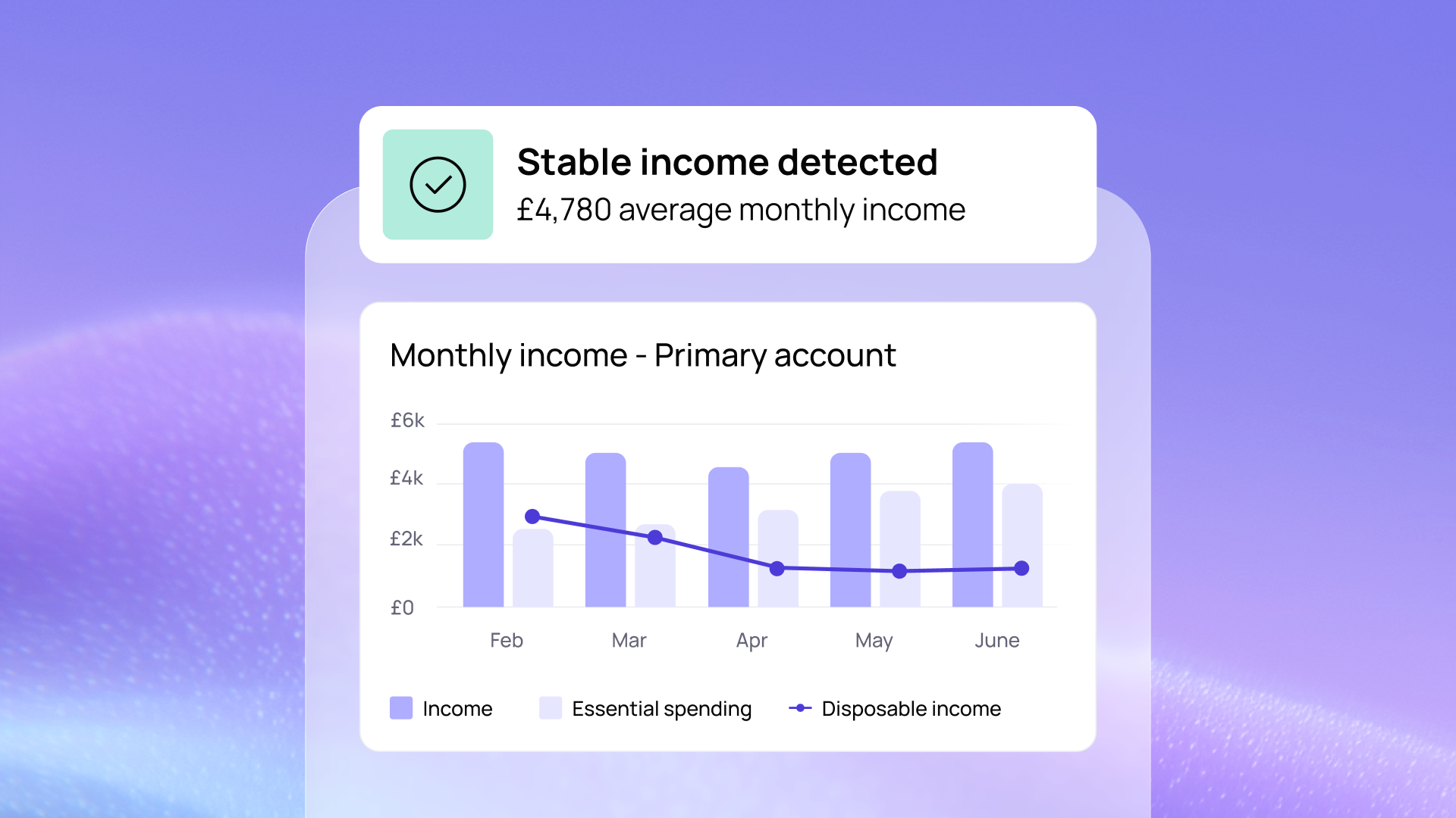
With TrueLayer’s open banking APIs, identity verification takes an average of 35 seconds. Money settlement into a wallet is near instant. This is a huge incentive for your users, so why not brag about it?

)

💎 Clarity: the clearest journeys convert the best
Users just want to get things done and get on with their day. They don’t want to jump through hoops, make difficult choices or be confused by complicated next steps. To avoid these issues, answers to the following questions should be built into your flow:
What exactly do I need to do?
Is this going to be difficult?
To answer the first question, the solution is as simple as using pre-selected fields and indicating recommended options. (Yes, really.) The second can be a little more complicated.
Most people can only comfortably handle five to nine chunks of information at any one time. The higher the number, the higher the cognitive load, and the less a user can actionably understand. When a user first tries open banking they’re introduced to a new financial concept, a never-before-seen authentication process, a litany of consents and an entirely new company — TrueLayer, in our case. That’s a lot for anyone to grasp.
The temptation is to add content and explain the complexity away, but we’ve found that can often cause more confusion. Instead, we suggest going for a less is more approach. Employ the concept of progressive disclosure by displaying only the most important information and actions, with the option to read more or view advanced settings by request. You can also look to use positive friction, but more on this later.
Long story short: give your users more, but only when they ask for it. This will improve learnability and efficiency, and reduce error rates. If they really want to know something, they’ll click. We promise. 👌

)

👐 Familiarity: interactions should feel intuitive
In UX, the word familiarity is almost synonymous with trust. To make your users feel like they’re at home, you need to address questions like:
What is this?
Have I used it before?
And most importantly:
Do I trust it?
Whenever possible, building on users’ existing knowledge of how a system works is the secret sauce for success. If a user intuitively understands the process, and knows how things will pan out, their anxiety is reduced and the likelihood of them completing the process is greatly increased.
But what do you do when the product or service you’re introducing is completely new? How do you drive the user to choose that thing over another?
Right now, most users don’t know what open banking is, let alone how to use it. And that’s not going to change overnight. So if we want to increase awareness and adoption, the burden of responsibility is on us (that 'us' includes you) to make open banking feel familiar.
We’ve found that the two most effective ways of doing this are: better copywriting and positive friction.
Copywriting
Some of our customers have used the words open banking or TrueLayer in titles or calls to action. This is inadvisable. While the consumer may have heard of open banking, most have not heard of TrueLayer. So we suggest using more recognisable terms in titles and CTAs, and using open banking and TrueLayer in body copy and descriptions. This will build familiarity, association and trust in the long term, and all without interrupting the user experience.
Positive friction
In both fintech and UX, we’re only ever two breaths away from talking about how we need to remove friction from one thing or another. However, sometimes friction can produce a positive impact on a user’s experience, especially when they need to learn new concepts.
By adding additional steps to the flow, you can build trust and better help users to navigate the journey. But be warned: this only works if you have employed positive friction in other aspects of your products, such as during the onboarding process. The repetition of these patterns will make it easier for the user to recognise what they’re being asked to do and to know how to react.
Positive friction should give the user more context, and explain what will happen next. These extra steps could include additional information like “you’ll only have to do this once”, or a provide a simple explanation of what TrueLayer is. And they are most effective when combined with illustrations and icons that make them more identifiable and user-friendly.
We only recommend adding one, two steps max. More than this and you run the risk of frustrating the user. And if you don’t use positive friction anywhere else in your app, it’s probably best to stick to progressive disclosure patterns instead.

)

🔒 Security: users must trust the method
Security is an essential element of any digital transaction, and most users will abandon a flow if they have even half a reason to mistrust the authentication method. So, similar to the previous point, users want to know:
Is this safe?
Do I trust it?
When it comes to selling a new method, your focus should be on relieving user anxiety. This means balancing positives like convenience and speed, with vital trust indicators like data safeguarding and social proof.
How do you do this?
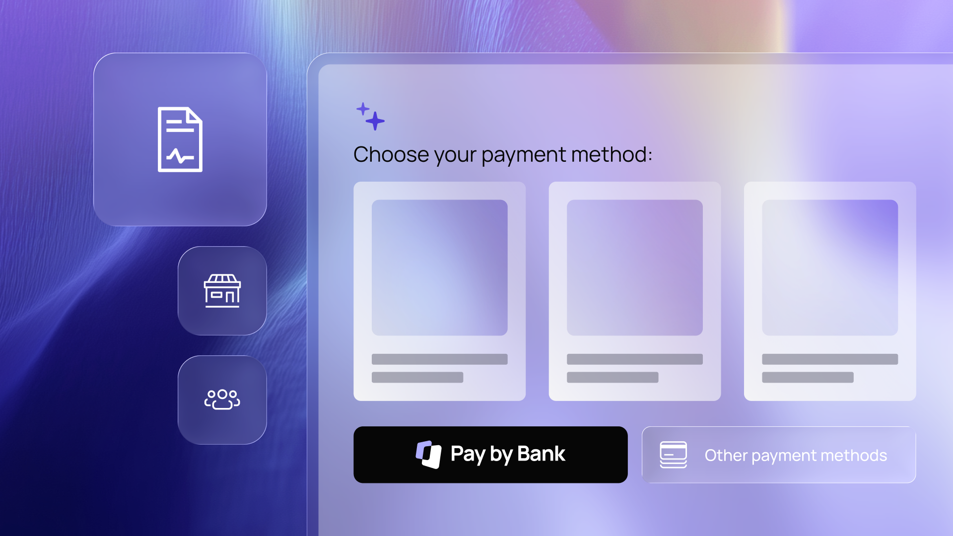
Progressive disclosure and positive friction. Which one you choose will depend on the UX patterns you’re already using in your app, but the point is that you can use these content spaces to spell out what happens to the user’s data and what safeguards are in place. Just make sure it’s all written in plain English.
Reassuring terms like read-only and bank-grade can make users feel more confident, and familiar icons like padlocks 🔒 help to underscore the point.

)

The all important order of importance
We talked about time, clarity, familiarity and security. In that specific order. And for good reason.
In the world of open banking, most users are first-time users. This is especially true of AIS service users, who need only connect their bank account to an app once and then re-authenticate in a few months. This makes the user journey unique and means it needs to be treated as such.
By arranging page elements in the order we’ve outlined, you can help first-time users choose open banking by demonstrating that:
It will save them time
It is super easy to use
Millions of people just like them already trust it
Their money and data are safe
Of course, this isn’t always the case. When it comes to things like wallet top-up, users might encounter your open banking flow multiple times a month. In this situation, the order should be treated a little differently, and familiarity will take the top position. Always consider what will be the most important factor for your user given their entry into the flow.
The bottom line
So all said and done, what does this actually mean for your conversion rates?

)
Early stage testing has resulted in a 10% increase in adoption rate for our customers, which translates to a considerable amount saved on transaction costs, as well as the opportunity to offer personalised services to more of their users.
And that’s just from making a few minor tweaks here and there, not implementing all the changes we’ve suggested in this article.
If this has whet your appetite, you’re in luck. This is just the first in a series of studies we are publishing on how improved UX and consumer awareness will push for greater open banking adoption. Watch this space. 👀
)
Payment choice, not cards by default: the view on agentic payments
)

Why the EU Presidency matters for the future of payments
)