)


)

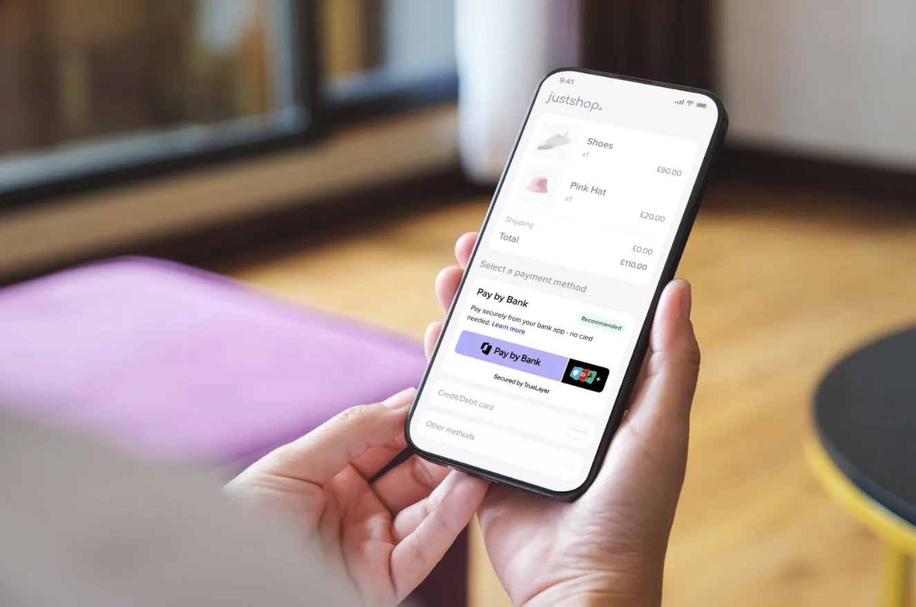
Hello Auth Dialog V2!
After several months of intensive design, product, and engineering work, we are incredibly thrilled to launch our new, customisable authentication dialog.
For those not familiar with it, the “Auth Dialog” is the end-user facing interface used by our Data API clients to ask for their consent. Its purpose is to guide our client’s end-users through the process of sharing their banking data with financial applications via both open banking and credential sharing.
Since our very first release of Auth Dialog V1, almost a year ago, a lot has changed in financial technology; Open Banking, PSD2, and the FCA released their official guidelines; financial applications started to integrate bank APIs to build their products; end-users approached financial applications/challenger banks and got exposed to financial user interfaces (‘UIs’).
Consequently, we decided that our Auth Dialog V1 needed a deep re-design to offer our clients an experience that is:
better integrated into our client's user journey through customisation;
more intuitive UX/UI to increase the flow completion rate;
compliant with FCA and PSD2.
How we did it: design thinking and client feedback
To achieve a better product, we aimed at solving both known and ambiguous aspects of V1 through Design Thinking. This non-linear and practical method led us to intermediate solutions that then became the starting points of alternative paths. Those paths allowed us to redefine the initial issues, and solve multiple, unexpected problems.

)
UX/UI research, several design brainstorming sessions, a lot of prototyping and user testing sessions kept us busy and led to the brand new version. Still, the most valuable information was client feedback. Thanks to their suggestions, we’ve shaped an interface that aims to reduce friction and provides universal guidance for a broad, mixed audience of end-users.
Let’s explore the new interface and take a closer look at its features!
Customisation: making the end-user journey better and better
And here comes the long-awaited news: the new dialog is customisable for all of our clients!
In our previous version, the only dynamic parts were the client logo and application name. With Auth Dialog V2, instead, you will be able to personalise:
Colour Palette — Change the background, buttons, and drop-down colours to fit your UI;
Help link — Redirect your users directly to your own FAQs page hosted on your domain;
Data Usage Copywriting — Explain to your users what you need their banking data for, using your brand and tone of voice;
Skip Consent Page — If you are an authorised FCA company, you can skip our consent, and use your own consent page.
This customisation will offer a better experience to your users and will better integrate within your brand guidelines. Accordingly, the transition between your UI and our Dialog is going to be more subtle and will give your end-users a smoother, frictionless journey.
Want to take a look at some of our clients’ customised UI? Here’s what ClearScore, Zopa, CreditLadder and Bitbond did.

Plenty of new UX features
We’re not finished yet!
One of the most important parts of the whole journey is when we ask the end-user to input their bank credentials. We worked hard to make this specific step frictionless by introducing:
Input labels: The labels are meticulously tailored to follow the ones of the banks;
Live validations: A pre-check of the credentials is done by using regular expressions;
Caps lock detection: Warn the end-user if caps-lock is activated. Useful for case sensitive details;
Password field visibility: Turn password field visibility on/off. Great for the end-user to see what they are typing; prevent typographical and validation errors;

Embedded Banks FAQs: Bank FAQs are at hand, so the end-user doesn’t need to leave the flow;
Dynamic colours: A cool background colour animation smoothly transitions to the bank login page; bank-specific colour palettes are used;
Error handling: End-users will not get lost. We completely reviewed our errors copywriting and UX and provided actionable items for the user to retry and/or better understand what they are experiencing;
Loader: The loader now shows the real amount of time needed to connect to the bank. We are also “hiding” a second automatic retry into that, in case the first connection doesn’t work.

Unfolding the new user interface
Following the end-user behaviour during the journey is one of the most important things the Design team at TrueLayer took into consideration while reviewing products’ UX. Monitoring end-user actions is a continuous effort that helps us understand what works, and what doesn’t.
Once we collected this data, we started questioning our design. First, we analysed friction points, then we began to take radical decisions to meet and keep up with the consumers’ demands & expectations. It is by following this UX review process that we started redesigning our Auth Dialog UI and decided to release a V2.
When it comes to UI decisions, we strongly rely on standard design principles and logic such as:
1) Task-focused approach
We decided to divide the operations available to the users into two columns and present them in terms of the problem domain. The left column solves problems and creates trust, and the right column guides the user to perform an action.
2) Proximity and spatial distribution of elements
We grouped similar information and organised the content in order to declutter the layout. By following a recurring pattern and intuitive positioning for common elements such as navigation bar, back arrow, and “Allow” button, we aimed at simplifying the user’s effort to complete the task. The use of colours in strategic elements such as the help toolbar creates continuity with our client UI. In this way the resolution of a specific problem it’s mentally associated with our client’s brand.
3) Visual Hierarchy
We wanted each area to have one kind of control that represents one important action, without other controls getting in the way. We emphasised the “Allow” button and the client logo as the 2 most important elements on the interface. A “Z-Shaped” pattern starts from the client logo and finishes on “Allow”. The visual, unconscious result is, that the user is “Allowing the client” to perform an action.
Beyond UI, we also decided to change the dialog’s front-end and convert it into a single page application built in React, with the goal of providing a more fluid user experience.
So … Welcome Auth Dialog V2!
We are delighted with the outcome we achieved, and cannot wait to see the new Auth Dialog V2 with your logo and custom colours on it!
Or, if you can’t wait to see it branded with your company logo and colours, you can try it out directly on our self-serve console. If you have feedback or questions please reach out on ZenDesk.
We look forward to tracking any new UX data we receive, and to analyse end-user behaviour so that we can iterate on our UX process, and continue to deliver a better, improved product to you.
Cheers to a better banking experience!

)

How traditional onboarding methods are holding iGaming operators back
)

Why iGaming operators are turning to TrueLayer for player onboarding

)