
)


)
The name Pay by Bank is now the industry standard for account to account payments powered in full or in part by open banking.
At the same time, Pay by Bank has been gaining popularity in the ecommerce industry, becoming a mainstream option at checkout for some of the biggest brands in the UK and Europe.
But if Pay by Bank is now the standard, how can you make sure you’re able to build and launch a Pay by Bank experience before your competitors do. And how do you make sure it performs better than your competitors’ experience (when they do launch one)?
That’s why we wrote this guide.
What will you learn?
This guide is a great starting point to understanding what makes a great Pay by Bank experience, and how your business can create one. In it, we’ll cover:
How to define and measure a high-performing Pay by Bank experience
The role of data-backed UX/UI to make the process of paying as clear as possible to your customers
How investing in Pay by Bank education breeds trust and familiarity in your new payment method
Why incentives can be the extra motivation to persuading your customers to try Pay by Bank for the first time
The role of wider merchant adoption and mass user insights to further optimise your checkout
Our tried and tested checklist for launching your Pay by Bank experience
Who is this guide for?
We’ve written this guide with payment leaders at ecommerce brands in mind, but if the idea of offering Pay by Bank at your checkout or payment page is anywhere near your 2026 roadmap, this guide will help.
Get to grips with Pay by Bank
Want to know more about what Pay by Bank is and how it works? Read our complete guide
Already at the stage where you’re looking for a partner to help you implement Pay by Bank: Read our buyer’s guide
Why are we qualified to teach you about Pay by Bank?
In short, Pay by Bank is what we do at TrueLayer. For the last nine years, we’ve taken the core offering of open banking, combined it with other useful technology, and turned it into a suite of payment products that help businesses across ecommerce, iGaming and financial services collect payments more cost-effectively, quickly and securely.
Importantly, we have experience building payment and checkout experiences that work. When offered, shoppers actively choose Pay by Bank, and we’ve learned how best to guide them through the payment flow to the all-important successful payment.
We work with some of Europe’s leading brands, including JustEat Takeaway, Ryanair, lastminute.com and Papa Johns. This guide is our hard-earned learnings on Pay by Bank condensed into one tactical, digestible and data-backed guide.
Chapter 1: How to define and measure a high-performing Pay by Bank experience
When you add a new payment method to your checkout, you want it to perform well. But what does this nebulous idea of performance mean?
Of course, technical performance is important — everything from uptime and page loading speed, to how well it’s optimised for different devices and real-time notifications in an easy-to-use dashboard all impact the user’s checkout experience.
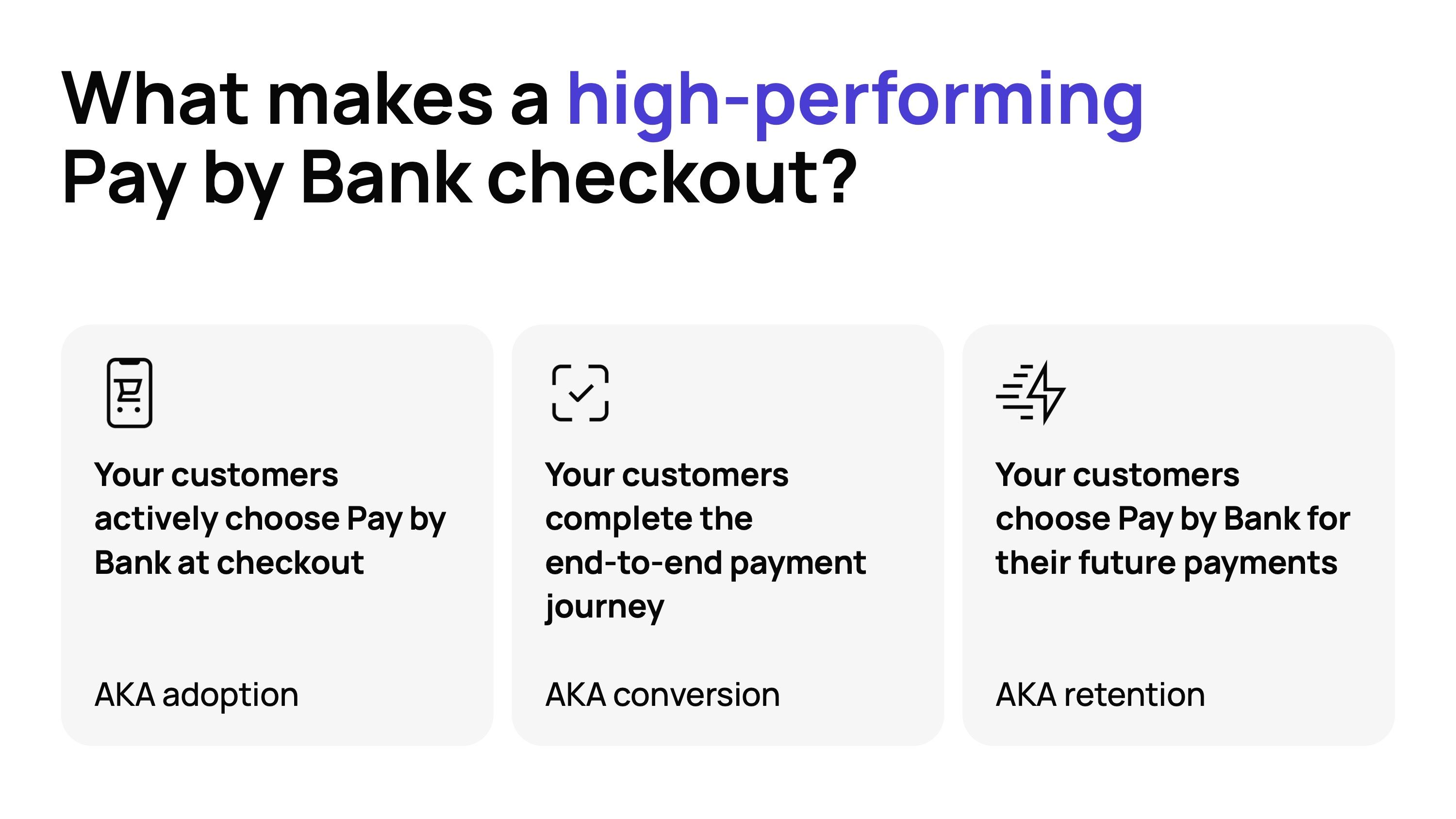
But what we’re specifically talking about is how you can make decisions about the checkout experience to get the highest possible proportion of your customers to take three key actions:
They actively choose Pay by Bank at checkout — AKA adoption
They successfully complete the end-to-end payment journey — AKA conversion
They choose Pay by Bank for their future payments — AKA retention

)
Master these three measures of success, and the other benefits of Pay by Bank will follow. The more of your customers that choose Pay by Bank time and time again, the higher its share of checkout will be. And the higher the share of checkout, especially compared to card payments and PayPal, the more cost-effective it becomes.
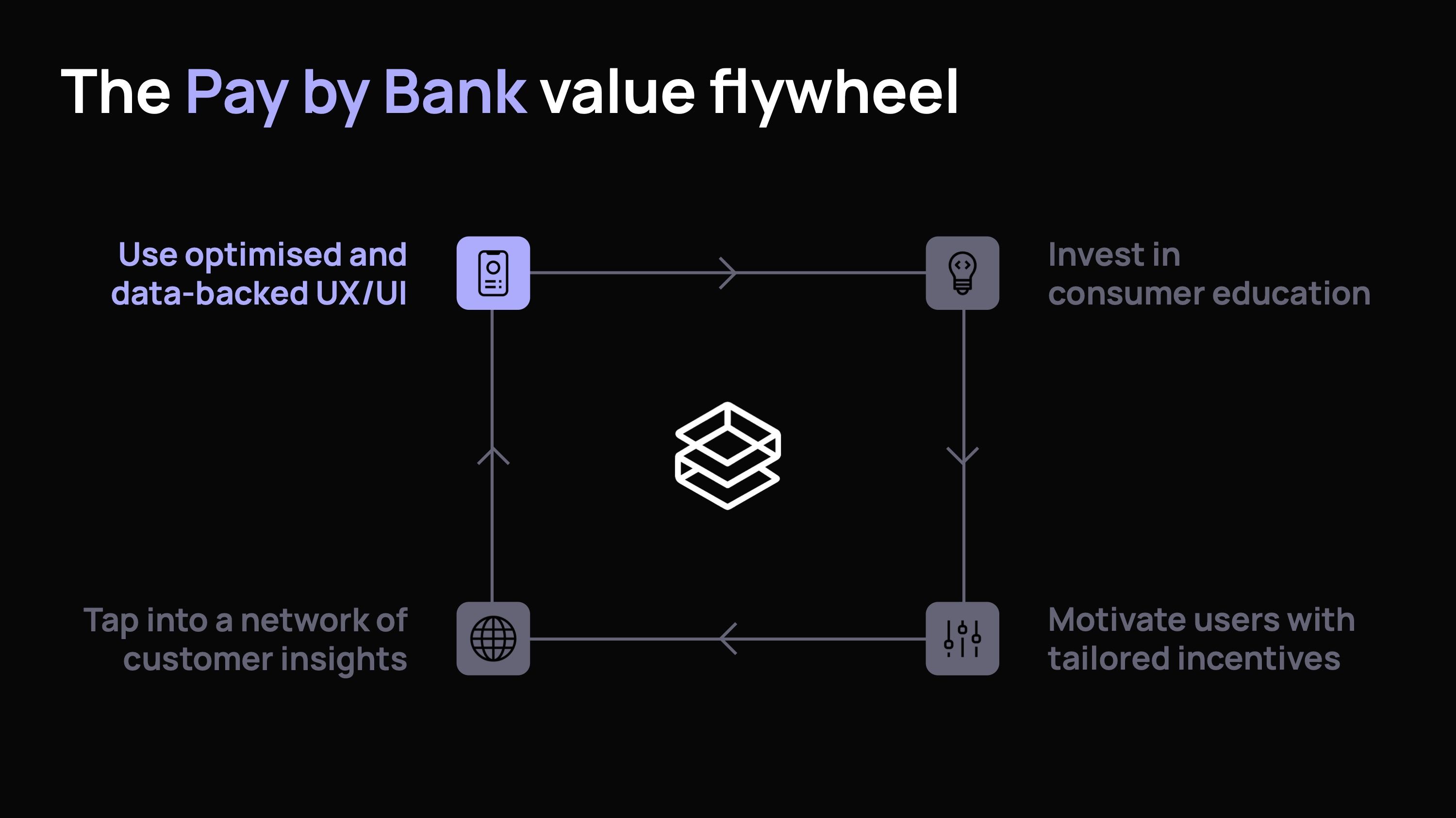
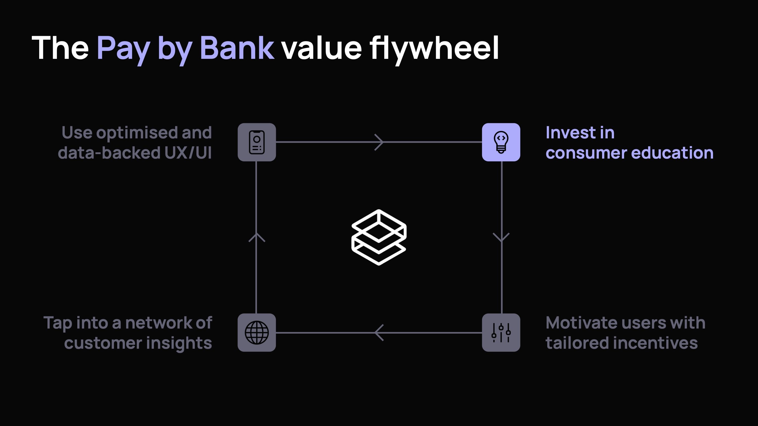
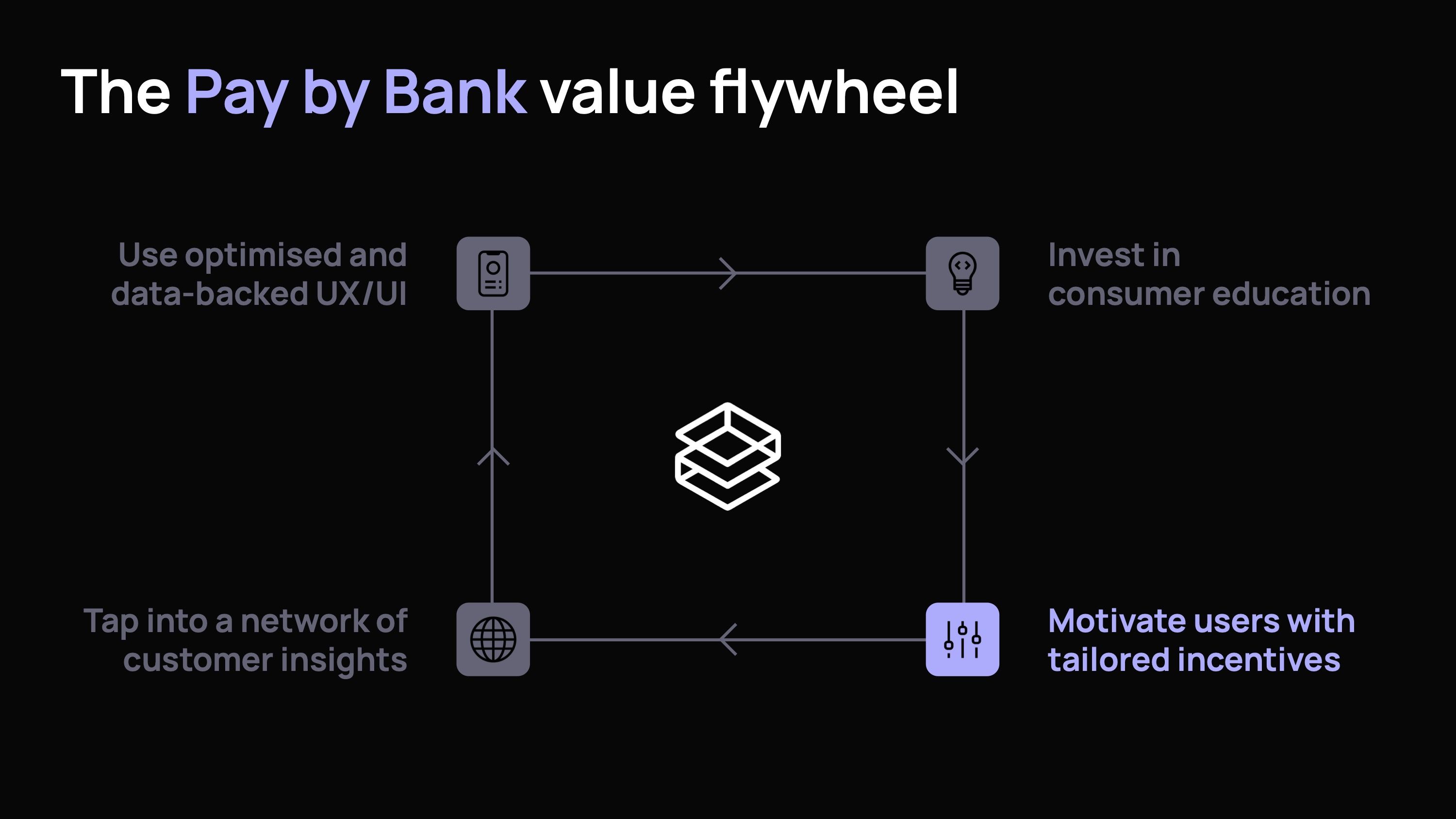
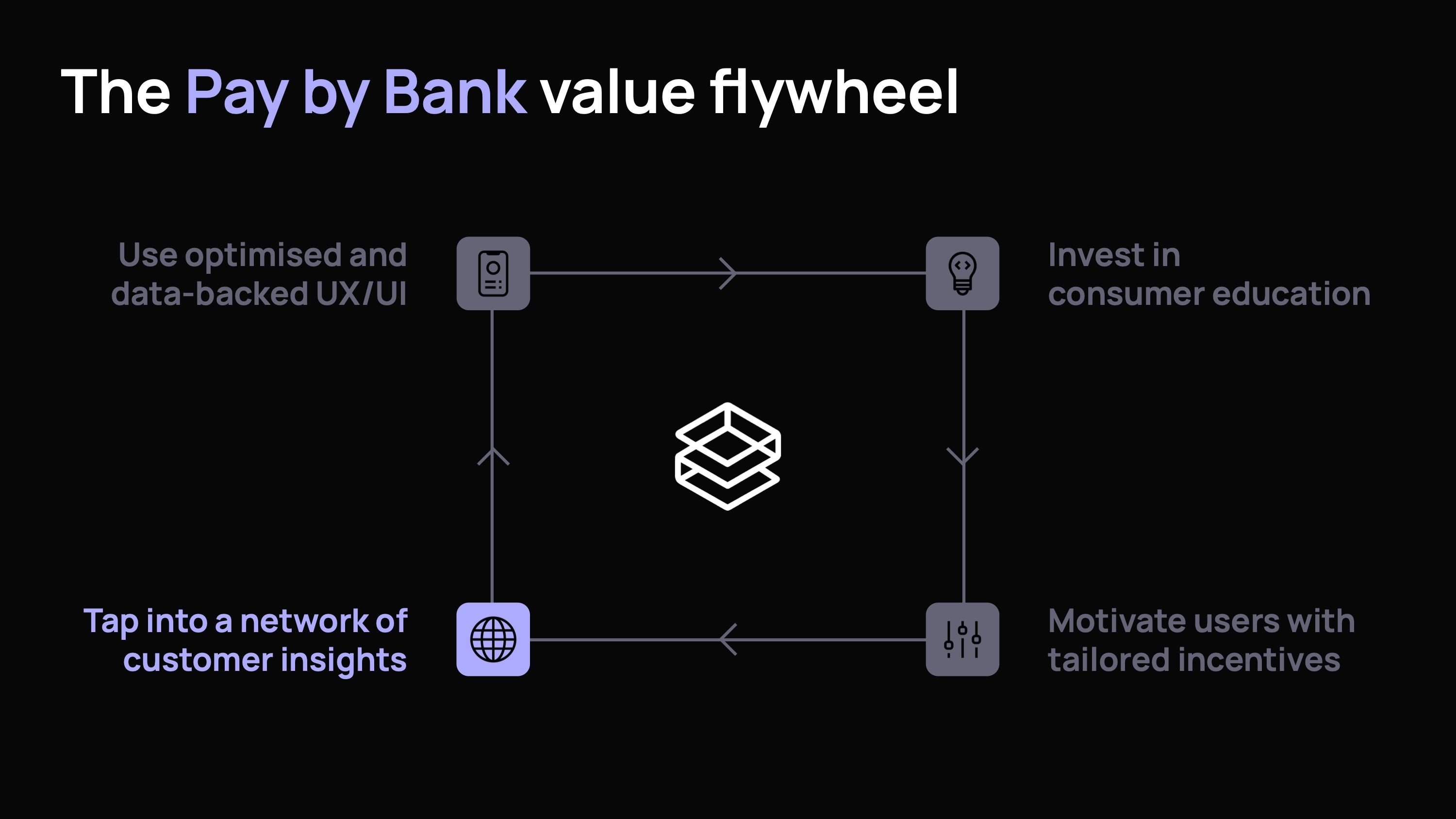
The Pay by Bank value flywheel
How do you make this a reality? When we’re working in partnership with merchants implementing Pay by Bank for the first time, we typically focus on four key areas that improve conversion adoption and retention.
Use optimised, data-backed UX/UI
Invest in user education in the checkout and beyond
Motivate shoppers with tailored incentives
Tap into a network of customer insights
)
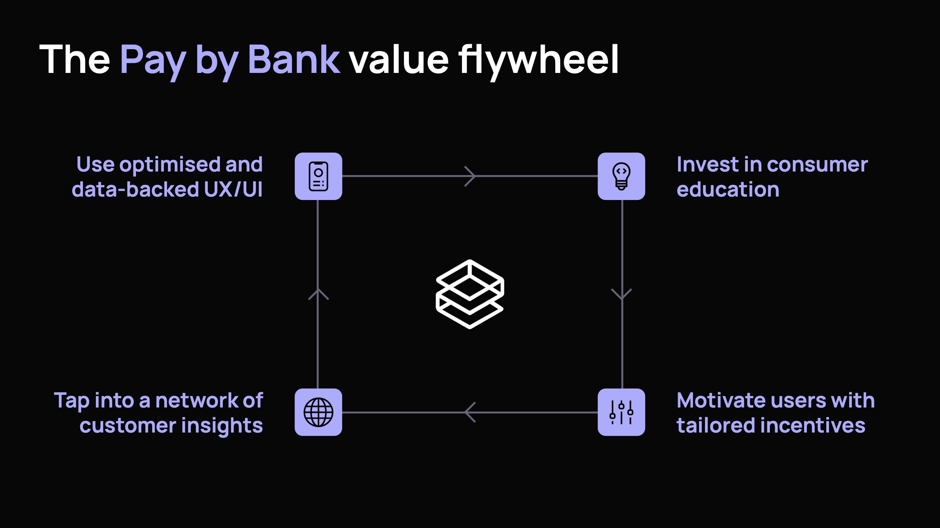
Together these form the Pay by Bank value flywheel. In isolation, they can improve adoption, conversion and retention. But together, they’re a virtuous circle where one element could be the spark that compels the user to select Pay by Bank, another to get them over the line, and another to keep them coming back to Pay by Bank in the future.
Chapter 2: The value of best-practice UX/UI in the payment journey
)
A good, streamlined Pay by Bank experience for a first-time user has six steps: the checkout page, the bank selection, the payment review, the bank login, the bank authentication, and the status page.
)
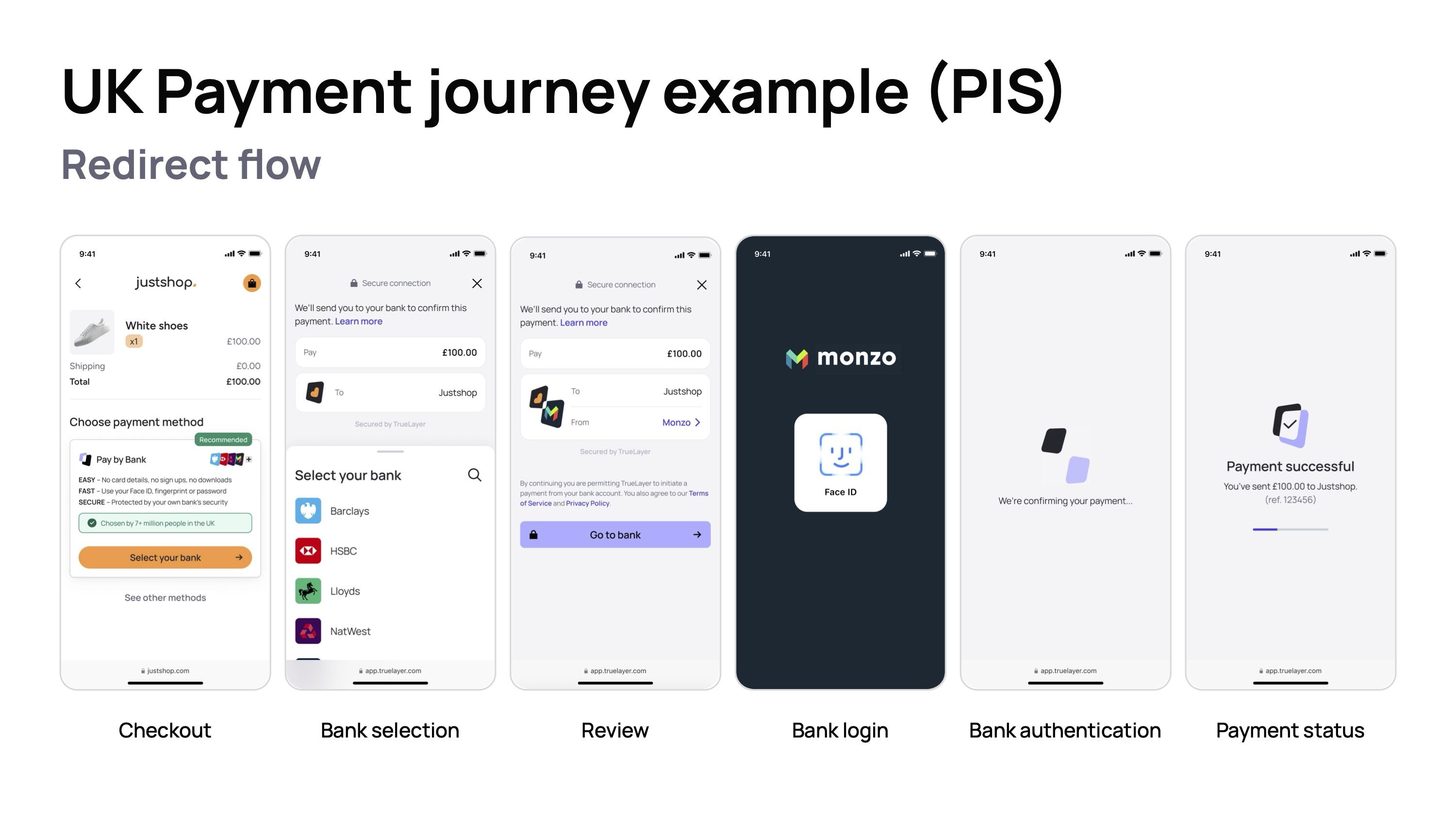
Steps four and five are controlled by the bank the user selects, and while TrueLayer works closely with banks to continuously improve their authentication flows, merchants can’t directly influence them. So we’re effectively focusing on four steps with our UX/UI choices.
At TrueLayer, our foundational UX/UI recommendations are built on behavioural design — a tried and tested method for product design that our team then builds on using research and data-backed insights to further tailor our merchants’ Pay by Bank experiences.
What is behavioural design?
Behavioural design is the practice of applying principles from psychology and behavioural science to create products, services, and environments that influence human behaviour. It systematically shapes actions by structuring choices to encourage specific outcomes.
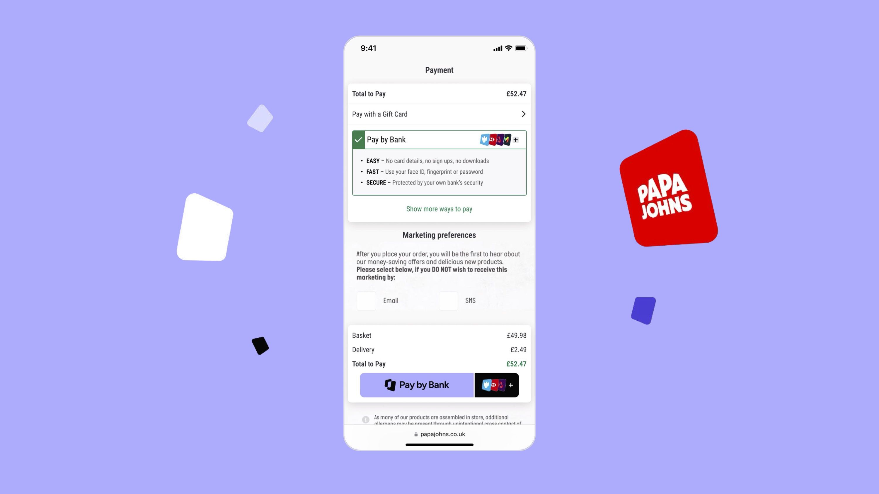
The checkout page
The first real test of a payment flow — will your customers choose Pay by Bank, or will they simply select the method of payment they’ve always used? Will they trust Pay by Bank? Do they know what to expect?
)
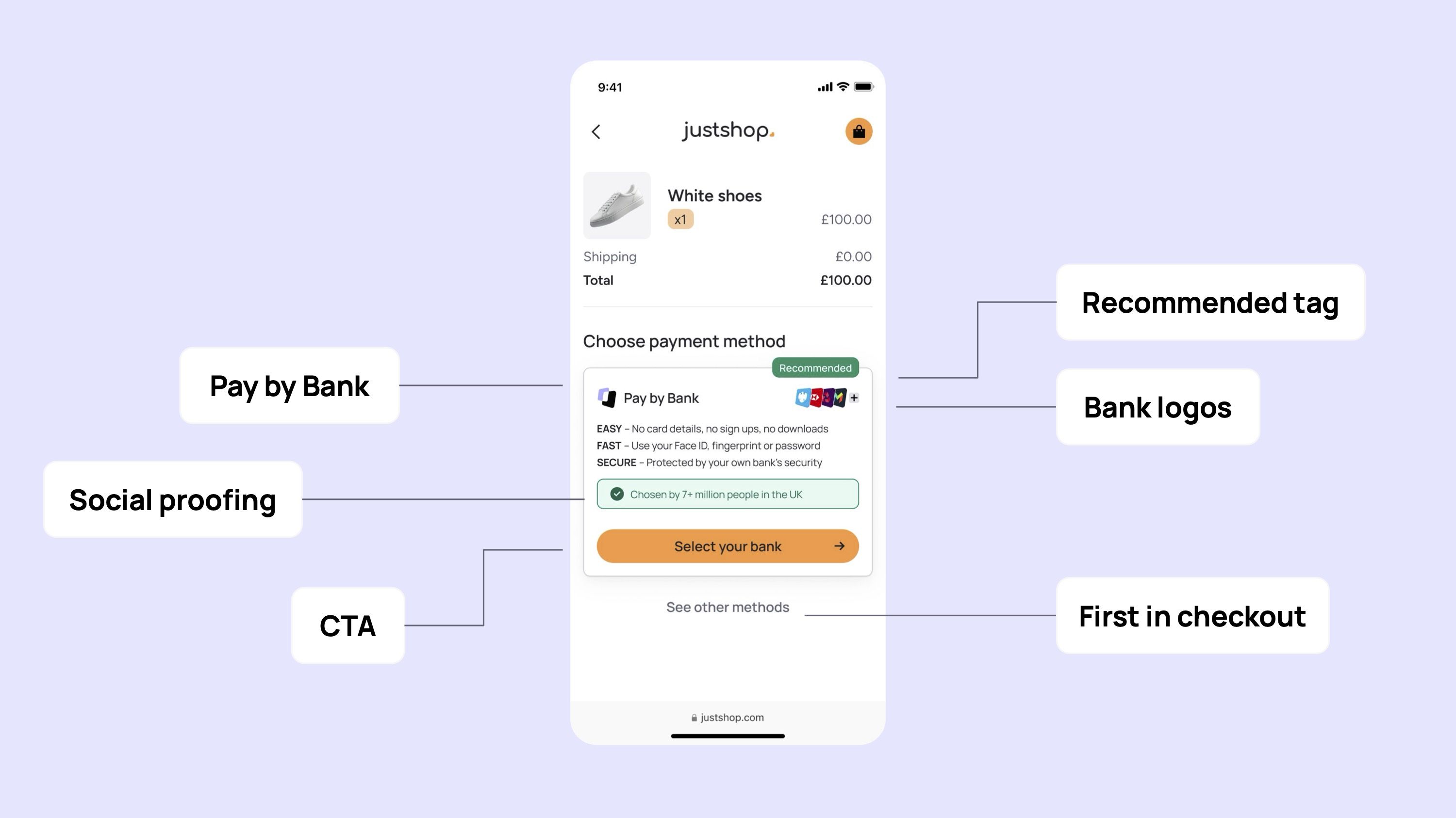
Position Pay by Bank first in the checkout
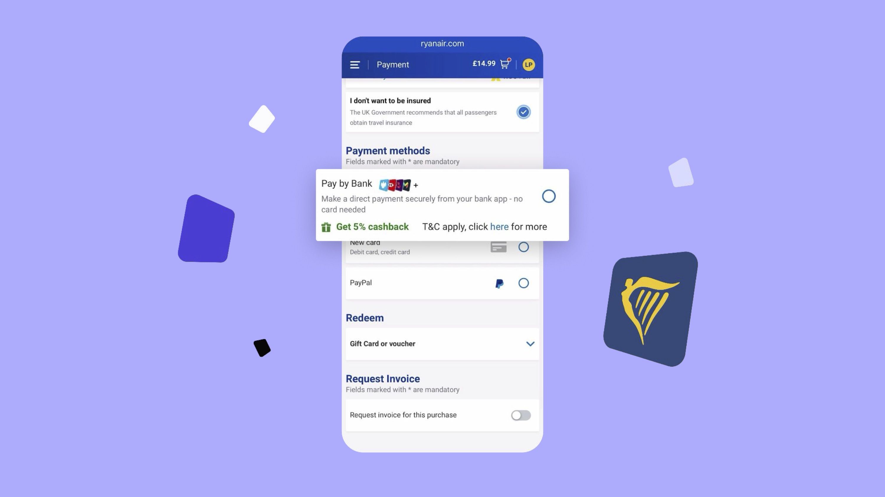
This is probably your biggest chance to influence Pay by Bank at checkout. Our research has shown that 38% of shoppers will base their decision to try Pay by Bank based at least partially on it being the first payment method in the checkout. It also tacitly shows your brand trusts and endorses Pay by Bank.
Use the payment name Pay by Bank
As we mentioned at the top of this guide, Pay by Bank has become the industry standard term for this payment method. It’s because it’s easy to understand and nods to how the payment method works. And as it’s now the standard, shoppers are becoming more familiar with it at different checkouts.
What's in a name?
💡 People find ‘Pay by Bank’ the most descriptive name for this payment method, compared to other potential names. Based on a survey of 900 people
Make use of social proofing
In situations where we are unfamiliar with something, we tend to follow the actions of others, relying on the wisdom of the crowd to help guide us to the best outcome. Social proofing is a way of influencing shoppers by drawing on the actions of others. By adding labels like “Chosen by X million people in the UK” to your Pay by Bank choice at the checkout, your customers will see this is an established payment method, rather than something they might be wary of.
Use a ‘Recommended’ tag
Recommended tags nudge your customers to make a quick decision. It signals your brand endorses Pay by Bank, and increases the user’s perceived trust of paying using it.
Show bank logos at checkout
Shoppers largely trust their banks and their mobile banking apps. Showing a selection of Bank logos at checkout indicates that Pay by bank works with your bank, and gives context on what to expect in the rest of the flow.
The value of bank logos
💡Our research found that 80% of people said that bank logos help them understand that they are going to pay with their bank. Based on a survey of 900 people.
Include a clear CTA
Make the next step intuitive and actionable. It encourages your customers to take the next step and prepares them for the next step in the payment journey.
Bank selection
The bank selection stage of the payment flow is likely new to your user if it’s the first time they’ve used Pay by Bank. Being an account to account payment, it’s not something you’d have experienced using card or PayPal. So it’s a key moment in the flow to get right.
)
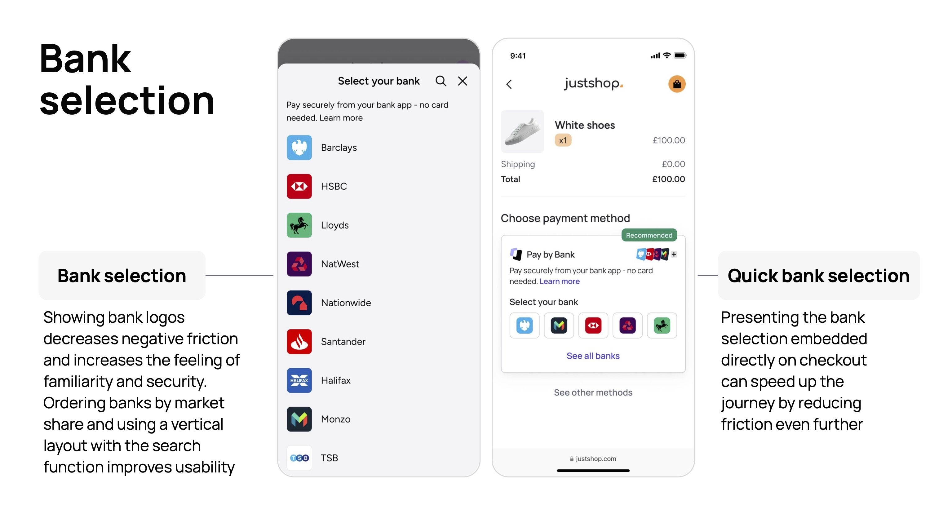
Show bank logos
Showing bank logos prominently at this step reduces negative friction in the flow and increases the feeling of familiarity and trust.
Use a vertical layout ordered by market share
A simple vertical scroll makes the selection choice as intuitive as possible, with a search function available if a user can’t easily spot their bank. Additionally, ordering the bank logos by market share, putting the most popular banks at the top, means the highest proportion of your customers will see their bank without needing to scroll.
Consider a quick bank selection module
You can go one step further and remove an entire screen for many users if you’re able to give Pay by Bank more space on the main checkout page. By presenting and embedding bank logos directly on the checkout screen you can reduce friction even further.
The review screen
This is a key stage of the payment journey, as it’s the point you hand off to the user’s bank. The right UX here can help improve conversion as the user is redirected to their banking app.
)
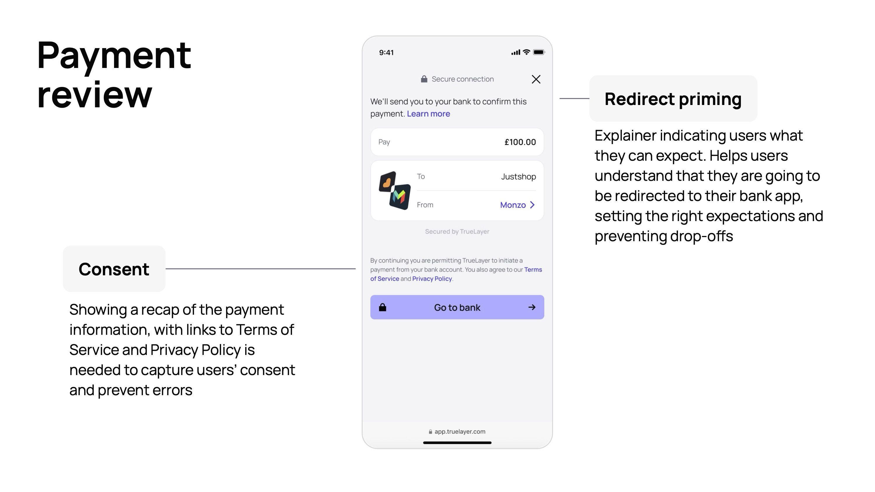
Use redirect priming
Explain that your customers will be redirected from the checkout page to their banking app, reducing the likelihood that a user will drop out of the payment process. Additionally, make the CTA personalised to the user’s bank app, such as “Open Monzo app”.
Recaps and consent
Show a recap of the payment information, including the amount to pay — which will match up to the amount shown in the banking app, further increasing trust in the user. Also show a clear and simple consent wording.
Payment status
While the payment status will hopefully be shown to your customer when they’ve already successfully completed their payment, it’s still important to provide reassurance so your shopper understands they’ve completed the payment and would feel confident using Pay by Bank again for their next purchase.
)
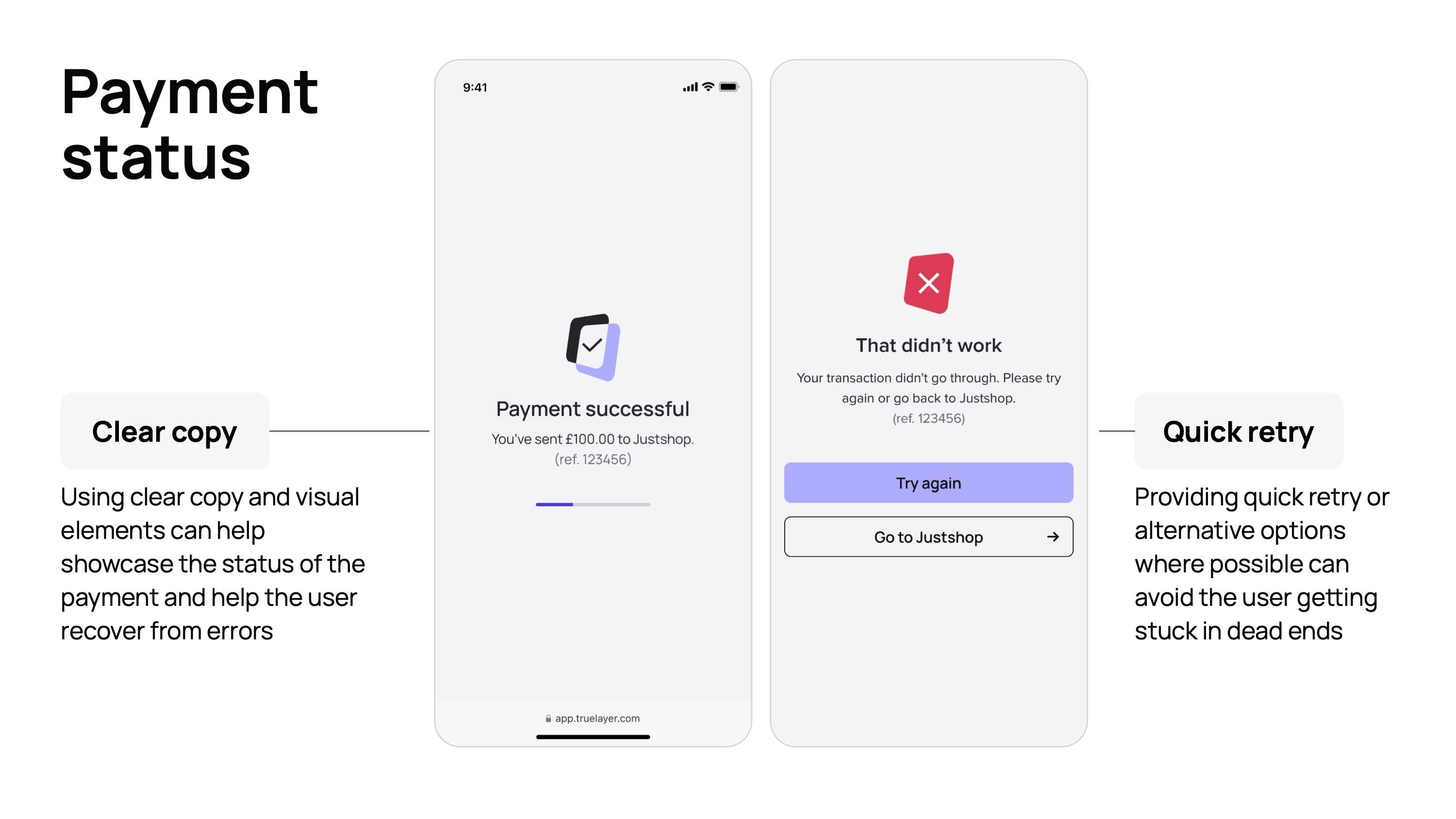
Write clear and simple confirmation copy
Use clear copy and positive visual elements to show when a payment has been successful and the payment process is complete.
Use quick retries when payments do fail
Occasionally payments do fail. When this happens, use the status screen to make it clear the payment hasn’t gone through, and give the user a clear next step for rectifying this. This could be a quick retry to simply try the payment again, or some other next step — such as changing to a different bank app — to avoid them getting stuck in a dead end that forces them to abandon the payment.
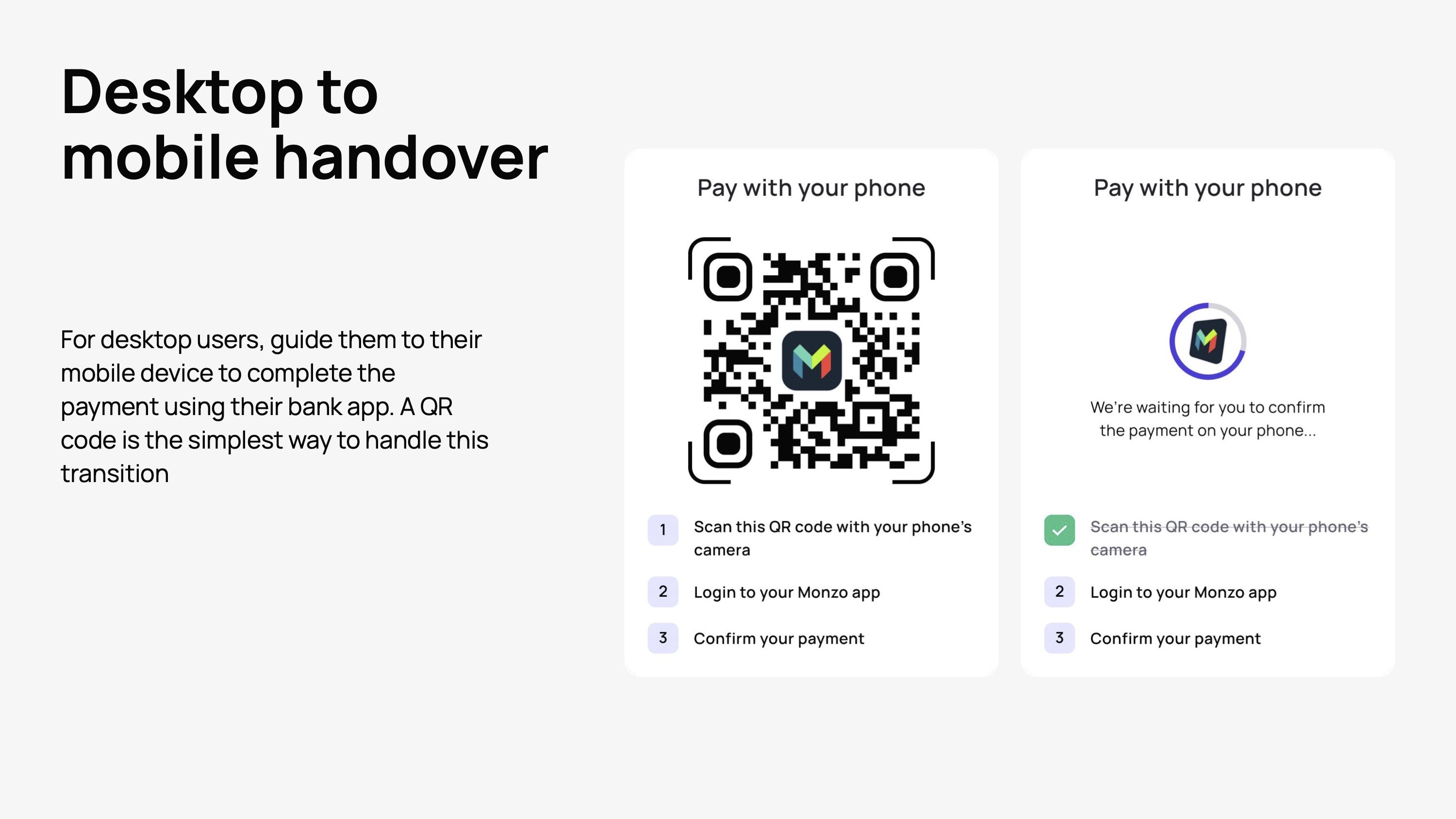
Bonus tip: Desktop to mobile handover
A key part of the Pay by Bank payment flow is the bank app authentication. This is a better experience when carried out on mobile, and while mobile is now the dominant device for ecommerce purchases, many still take place on desktop.
A simple and effective way to handle this is a desktop to mobile handover. Displaying a QR code is an efficient way to make this happen. Display the selected bank along with clear instructions on how to complete the flow. At the same time, make sure you still offer the option to continue on desktop for those who prefer not to switch devices.
)
Chapter 3: Invest in consumer education to overcome any initial uncertainty
)
Pay by Bank has benefits for consumers and businesses alike. But shoppers are creatures of habit and are understandably skeptical of any new payment method. To convince and reassure a shopper to try Pay by Bank for the first time, there are three questions you need to provide an answer to:
How does Pay by Bank work?
Is Pay by Bank secure?
What’s in it for me?
And there are four places where you can communicate these answers:
At payment selection
Inside the Pay by Bank flow (covered in Chapter 2)
Inside the payment flow of other payment methods
Across marketing channels
This process is critical to maximising adoption, convincing your customers to give Pay by Bank a try, and to increase conversion, via reducing the likelihood that uncertainty will cause user drop off.
Educating shoppers at payment selection
While Pay by Bank is a growing payment method that millions of UK shoppers use every month, for many shoppers, seeing Pay by Bank at your checkout will be the first time they encounter it. This means choosing Pay by Bank is an active choice of not using a different payment method, assuming you have multiple options at checkout.
)
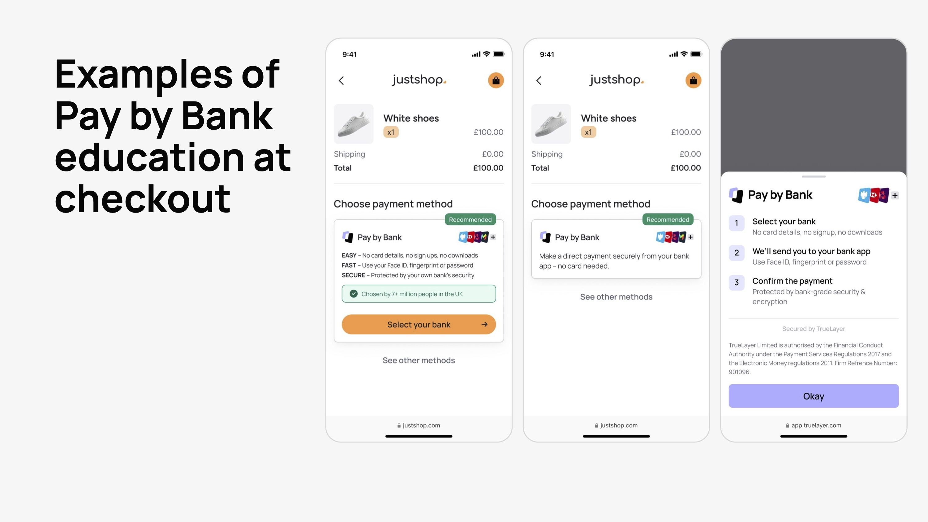
This means the payment selection screen is key to educating shoppers and setting expectations of what to expect when using Pay by Bank.
Use the easy, fast, secure descriptors
Pay by Bank is easy, fast and secure; three benefits that your customers will understand and appreciate. Using these three benefits to describe Pay by Bank at checkout helps build trust among shoppers, reinforcing the benefits and providing extra context on what they should expect:
Easy - No card details, no sign ups, no downloads
Fast - Use your Face ID, fingerprint or password
Secure - Protected by your own bank’s security
If limited space is available, a simple message like “Make a direct payment securely from your bank app — no card needed.” can also be impactful.
)
Use positive friction to add additional context
If your shopper still needs more reassurance or context, add a “Learn more” link to your Pay by Bank descriptor, which then opens a modal or accordion to further explain how it works. The modal can then easily be swiped away to return to the payment selection screen.
Educating shoppers inside the payment flows of other payment methods
One powerful way to introduce shoppers to Pay by Bank is as a sales recovery method when other payment methods cause the user unnecessary friction, or even when the payment fails entirely. Card payments fail anywhere from 5-10% of the time, so offering an alternative payment method both saves potential lost sales, as well as offering a timely introduction to Pay by Bank.
)
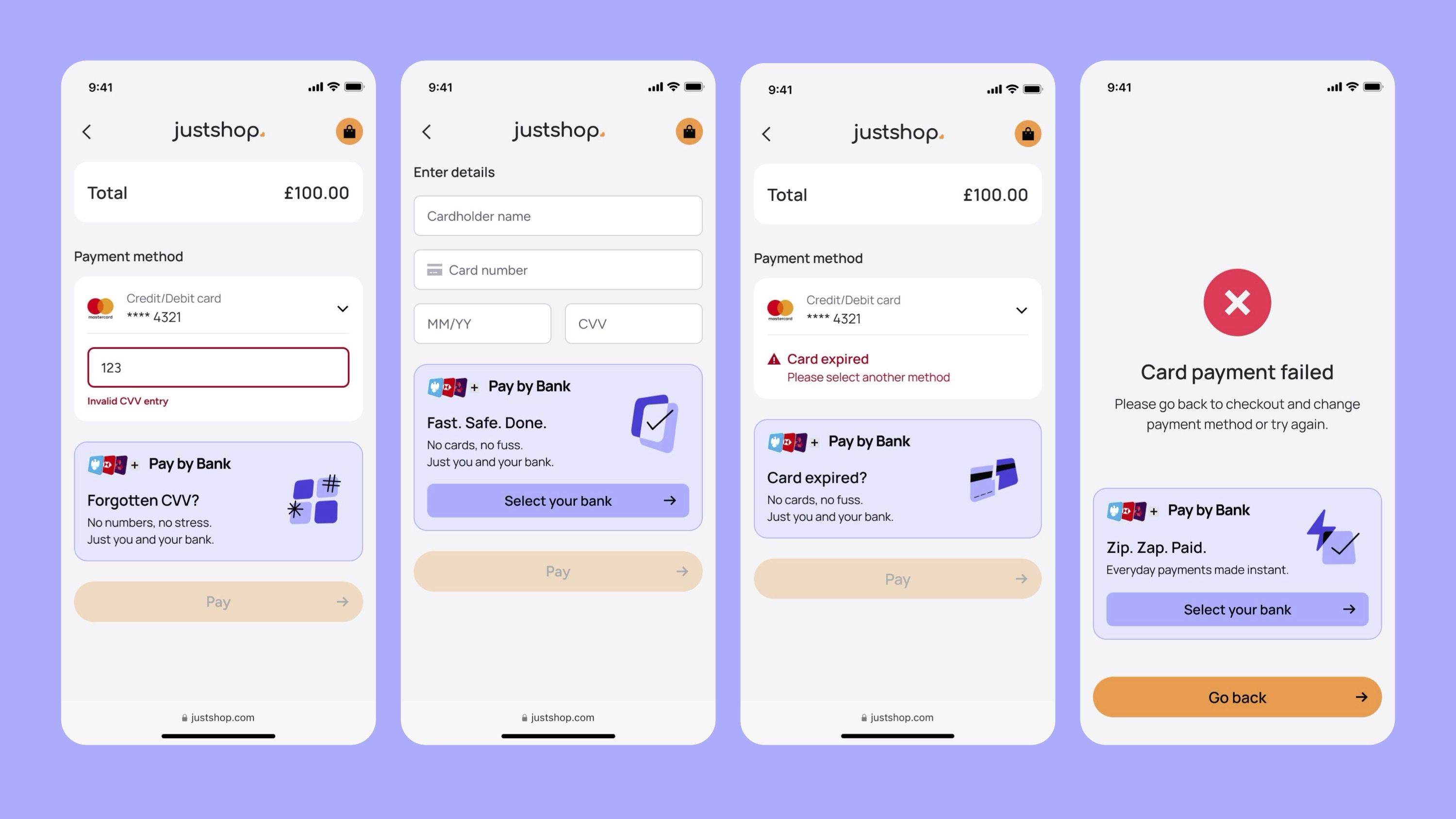
Introducing Pay by Bank when adding a new payment card
Adding a new card — the so-called sixteen-digit nightmare — takes time, requires the shopper to have their card on hand, and it’s easy to mistype a detail, causing the process to fail.
Using messaging like “No card? No problem!” alongside contextual benefits, including how simple Pay by Bank can be, is a great way to nudge shoppers toward Pay by Bank.
Introducing Pay by Bank when shoppers forget their CVV
Even when a user has card details saved, they will still be asked for their three-digit CVV. If they don’t have their card to hand and forget that CVV, they can’t complete the payments.
Use messaging like “Forgotten your CVV?” with a clear CTA to try Pay by Bank.
Introducing Pay by bank when a payment card expires
When a card expires, forcing them to add a new payment card, it’s another opportunity to budget them towards Pay by Bank. It’s especially powerful here as the shopper will likely have just encountered an error message when trying to pay.
Use messaging like “Card expired?”, alongside benefits highlighting that it’s both fast and secure.
Introducing Pay by bank when a card payment fails
At the point of a card payment failing, your customers are either left at a dead end where they simply have to abandon the payment entirely, or — at best — restart the payment and hope that it will work next time.
Offering Pay by Bank at this point is a good way to nudge shoppers toward Pay by Bank, while also potentially recovering a sale that would otherwise be lost.
“TrueLayer also showed us how we can use Pay by Bank as a sales recovery method as an additional way to recover failed payments and reduce costs…if you can recover 20% of failed payments by offering Pay by Bank as an alternative, we can rescue over £1million in revenue each year.
Read the full customer storyEamon Lindsell, Senior Product Manager

)

Educating shoppers across marketing channels
Pay by Bank education doesn’t just happen at checkout; it happens throughout the entire customer experience. Merchants who use a combination of email newsletters, dedicated landing pages, web banners and in-app messaging see a better adoption of Pay by Bank.
The power of user education
💡 One merchant who launched Pay by Bank with TrueLayer saw a 10% uplift in conversion after adding a simple in-app banner recommending Pay by Bank to its users.
)
Chapter 4: Motivate shoppers to try Pay by Bank and increase adoption with incentives
)
A TrueLayer survey from late 2024 showed that over two thirds or UK shoppers would be happy to try Pay by Bank if offered it.
But being happy to use Pay by Bank, and choosing it over a payment method you’re already familiar with is a different challenge. Card payments may have their drawbacks, but UK customers largely know and trust them, even if this causes challenges for merchants.
You want your customers to choose Pay by Bank because it means instant settlement, lower operational costs and no chargebacks. Shoppers, once they’ve tried it, are likely to stick with Pay by Bank. Cashback app JamDoughnut now sees 85% of all returning user transactions powered by pay by Bank.
But forcing a new payment method can lead to unnecessary churn, so finding more positive ways to bring about change can be much more powerful. This is why we recommend incentives as a key part of the Pay by Bank value framework.
)
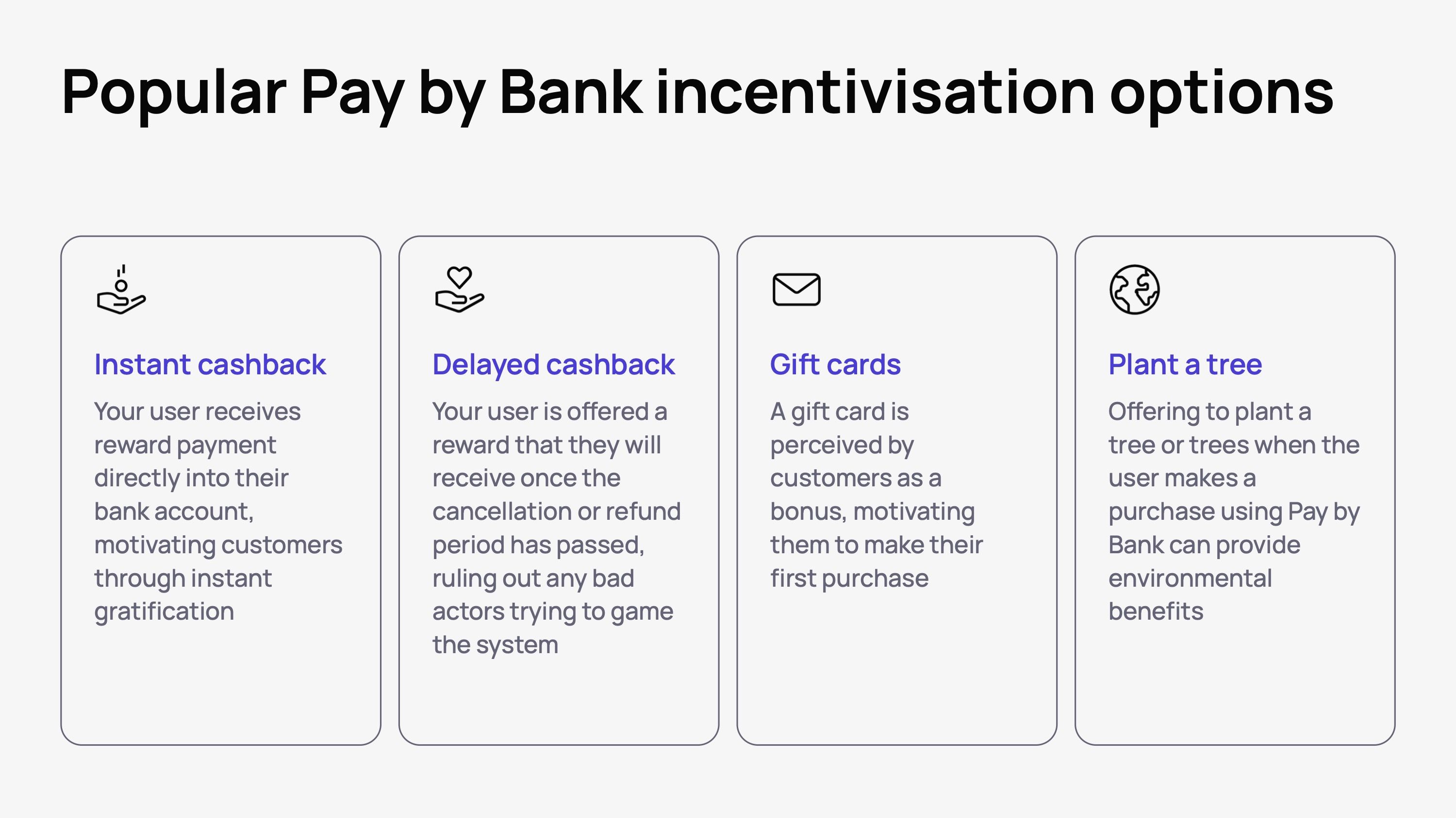
Select the right reward for your user
Different incentives will work differently for different people. You need to make sure your choice of incentives is the right tipping point to convince your customers to try Pay by Bank. We recommend one of the following four incentive options
Instant cashback: your user receives reward payment directly into their bank account, motivating customers through instant gratification
Delayed cashback: your user is offered a reward that they will receive once the cancellation or refund period has passed, ruling out any bad actors trying to game the system
Gift cards: a gift card is perceived by customers as a bonus, motivating them to make their first purchase
Plant a tree: offering to plant a tree or trees when the user makes a purchase using Pay by Bank can provide environmental benefits
)
Embed user incentives as part of your payment journey
To maximise the chance of your user accepting an incentive by choosing Pay by Bank, make sure it is clearly communicated in the payment journey. Use banners and labels in each step of the payment journey, reminding them of their upcoming reward.

)
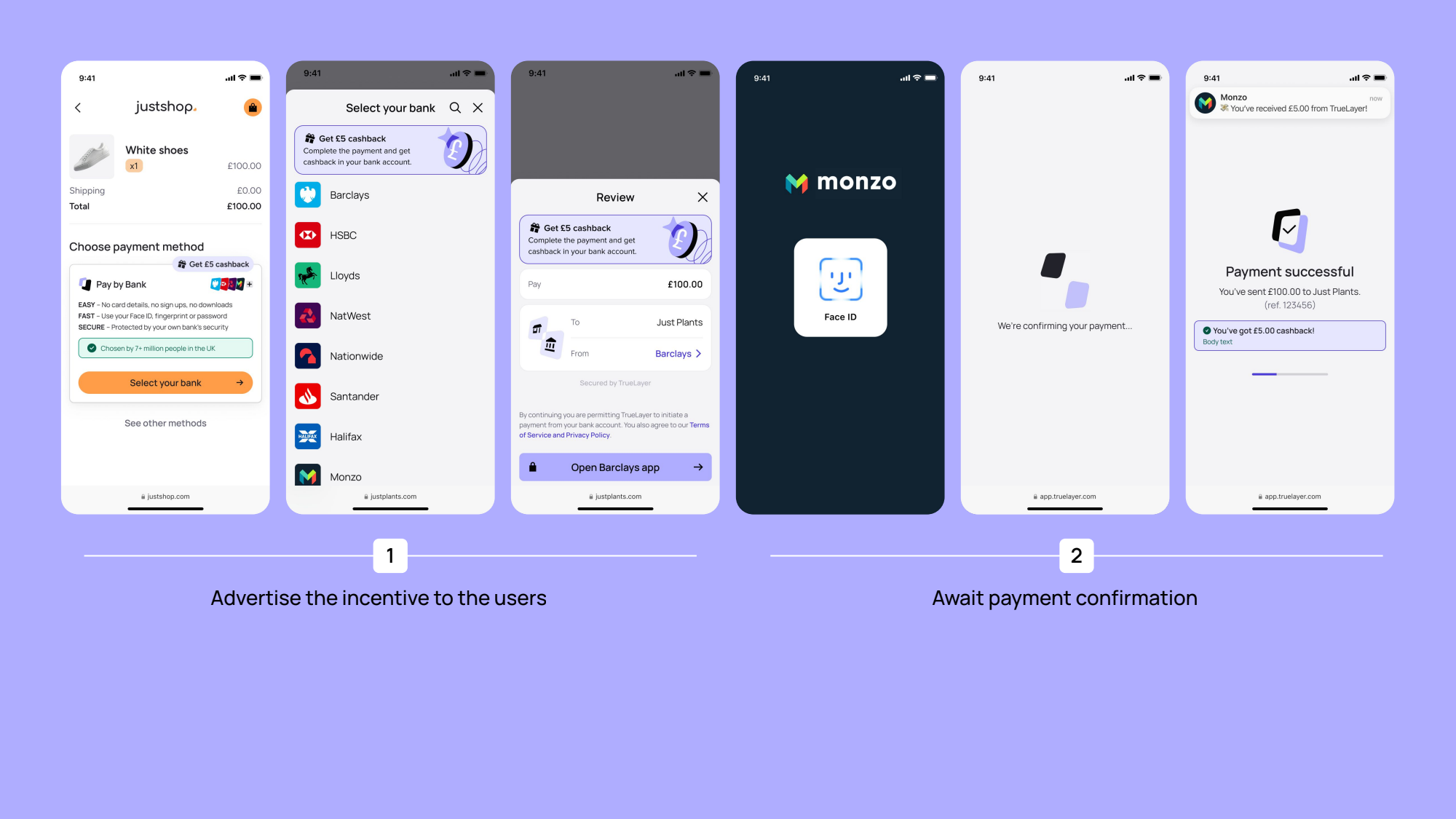
Be clear what and when they user will receive their incentive
At the payment status page, upon receipt of a successful payment, provide simple copy that explains when and how the user will receive their reward. If it’s an instant reward, make sure the payout process is indeed instant and be clear the user has successfully received their reward.
Promote incentives beyond the checkout
While contextual copy and banners at checkout are important, promoting the incentive to your customers elsewhere — similar to the education element we discussed in Chapter 3 – will increase the likelihood of uptake. This could include:
Website banners
Newsletters
In-app notifications
Direct mail
JamDoughnut and incentives
JamDoughnut allows customers to earn cashback or reward points with thousands of UK businesses. From groceries to ticketing, dining out to home improvement, there’s something for every shopper.
JamDoughnut works with TrueLayer to offer Pay by Bank to its shoppers to make the most of a cost-effective, instant and reliable payment method — and to offer an alternative to card payments.
To maximise adoption of Pay by Bank, JamDoughnut offered customers double the cashback or points. The combination of a seamless user experience and motivating incentives led to:
90% conversion rate with Pay by Bank
85% of Pay by Bank transactions come from returning customers
90% of all JamDoughnut payments use Pay by Bank
“I personally choose open banking because it's quick and easy. But also because I'll use this money to build up a pot that I'll use to pay for things like holidays and days out.”
— Money Saving Amy, JamDoughnut customer and personal finance influencer.
Chapter 5: How to leverage wider merchant adoption and mass user insights to further optimise your checkout
)
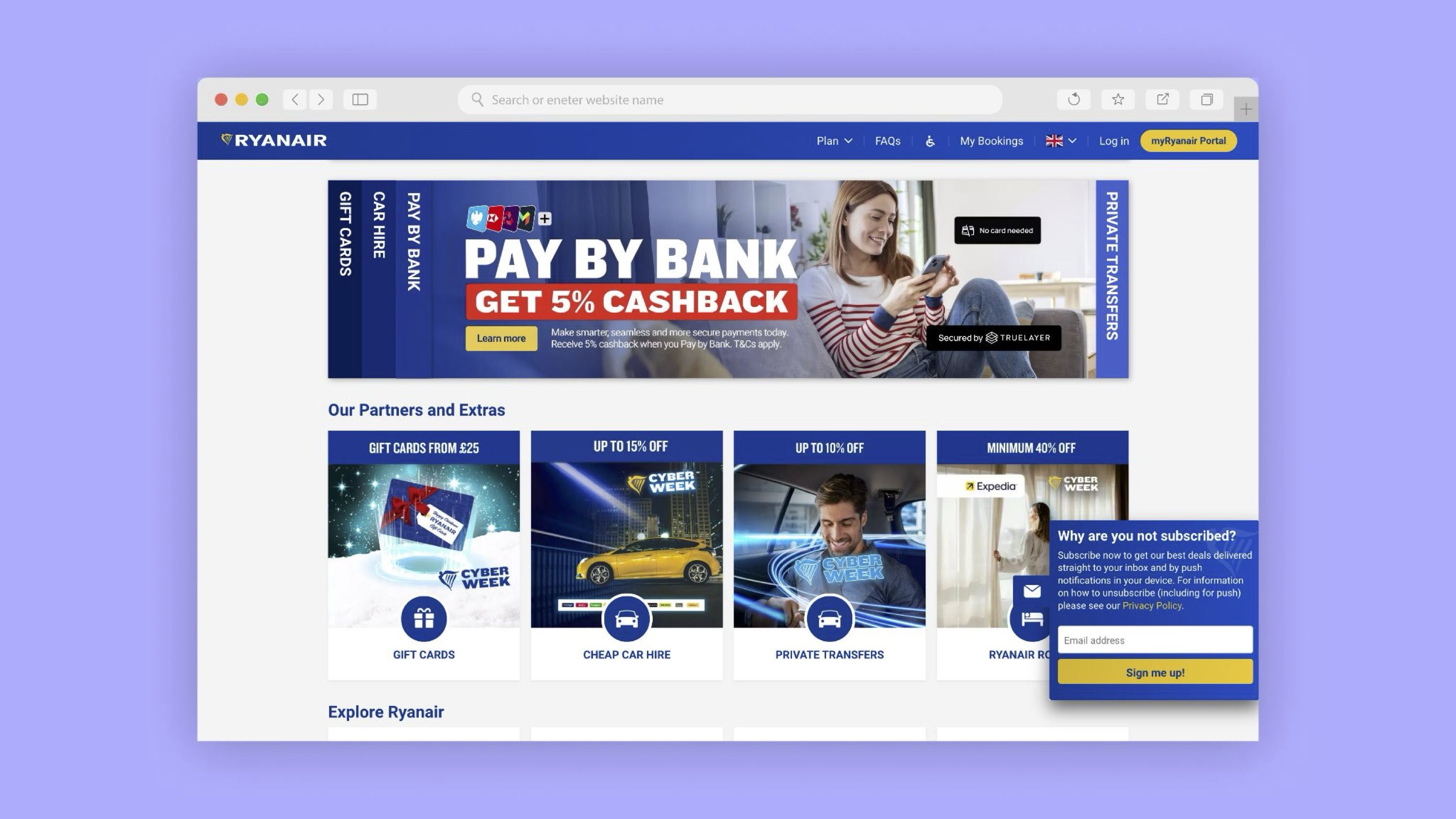
Pay by Bank already has traction in some industries like financial services and igaming. Meanwhile, brands like Just Eat Takeaway, lastminute.com, Ryanair, Papa Johns and others have built the foundations for Pay by Bank’s success in ecommerce.
But while UK shoppers make 33 million Pay by Bank payments every single month, it will only become a true mainstream alternative to costly card payments when the majority of shoppers instantly recognise and trust it. For that to happen, merchants have to lead the way by adopting and educating shoppers on Pay by Bank.
The fourth and final lever of the Pay by Bank value flywheel explores how the widespread adoption of Pay by Bank and the universe of data and insights it gives us all can lead to greater adoption, conversion and returning-user conversion.
At TrueLayer, we simply call it the TrueLayer Network.
What is the network effect?
The network effect is the phenomenon where the value of a product or service — in this case Pay by Bank — increases as more people use it, leading to greater user engagement and loyalty, as well as growth for businesses.
With Pay by Bank, the more shoppers that use it, the more valuable it becomes, as the insights that drive adoption and conversion become more powerful. The TrueLayer Network, for example, adds nearly a million new consumers every month. That’s one every three seconds — with a total of 20 million consumers now in the network.
📈 TrueLayer network in action
They say a rising tide lifts all boats. While your shoppers may be using Pay by Bank with your brand for the first time, they are increasingly likely to have used it on other trusted merchants. By creating a set of consistent elements across the Pay by Bank journey, shoppers are quicker to trust Pay by Bank wherever they use it.
At TrueLayer, we’ve seen a 22% uplift in conversion for shoppers who have tried Pay by Bank before — regardless of where they used it — compared to brand new users.
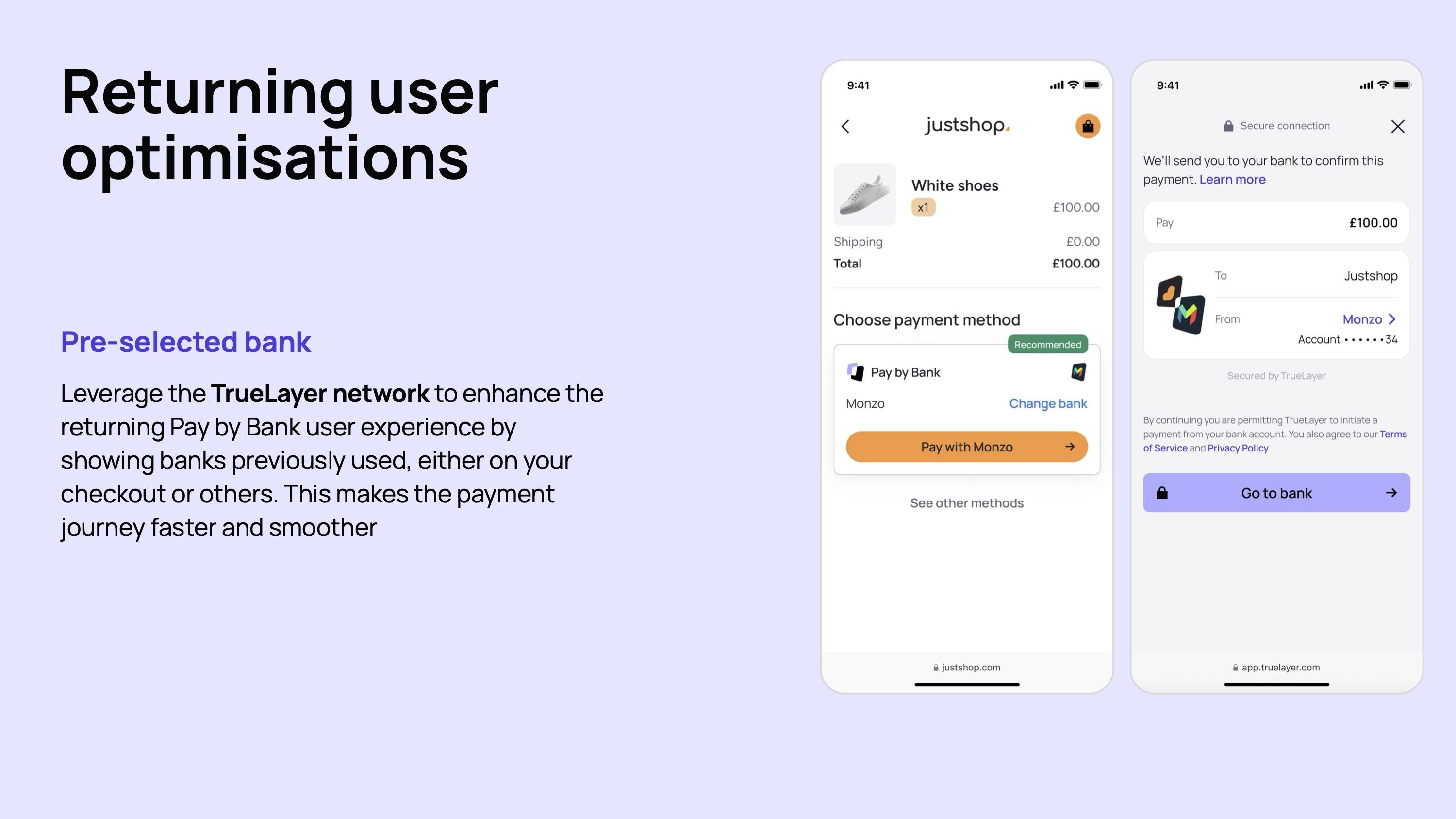
Optimising the returning user journey
The Pay by Bank flow is simple and quick for shoppers, but even small additional improvements can further improve adoption and conversion. While a new Pay by Bank user needs to select their bank from the list on the bank selection screen, the TrueLayer network pre-populates the user’s previously used bank, helping streamline the transaction process even further.
)
Chapter 6: The high-performance Pay by Bank checklist
The Pay by Bank checklist
Checkout page UX
☑️ Position Pay by Bank first in the payment flow to maximise adoption
☑️ Use social proofing to boost user confidence
☑️ Include a ‘recommended’ tag to increase perceived trust
☑️ Include bank logos to familiarise shoppers with the payment flow
☑️ Call your payment method the recognised industry term ‘Pay by Bank’
☑️ Make your CTA intuitive, providing context on next steps
Bank selection page UX
☑️ Display bank logos to reduce negative friction
☑️ Order banks with a vertical scroll to make it easy for shoppers to find their bank
☑️ Order banks by market share to maximise shoppers who will see their bank without scrolling
☑️ Consider adding a quick bank selection option on the checkout page
Review page UX
☑️ Use redirect priming to prepare shoppers to be sent to their banking app
☑️ Show a recap of the payment information to reduce drop offs
Status page UX
☑️ Write clear and simple confirmation copy to show when a payment has been made successfully
☑️ Offer clear actions for the user to take when a payment does fail
Desktop to mobile handover
☑️ Give desktop users an option to scan a QR code and complete their payment on mobile
Educate shoppers at payment selection
☑️ Use the fast, easy, secure messaging framework
☑️ Use positive friction, like modal pop ups to add additional context
Educate shoppers in the card payment flow, by promoting Pay by Bank at the following moments:
☑️ When the user’s card expires
☑️ When the user forgets their CVV
☑️ When the card payment fails
☑️ When the user needs to add a new card
Educate shoppers across marketing channels
☑️ Use in-app banners, newsletters, web banners and dedicated landing pages to educate your customers on Pay by Bank
Incentivise shoppers to actively choose Pay by Bank
☑️ Select the right reward to motivate your customers
☑️ Embed incentives messaging directly into your Pay by Bank checkout flow
☑️ Be clear about how and when your customers will receive their reward
☑️ If the reward is instant, use instant Payouts to make sure the experience matched the promise
☑️ Promote incentives beyond the checkout, using on-site banners, newsletters, in-app notifications and more.
Tap into cross-merchant Pay by Bank networks
☑️ Benefit from improved conversion rates among shoppers who have tried Pay by Bank before on other merchant checkouts
☑️ Streamline the Pay by Bank journey by reducing steps for returning users
Maximising Pay by Bank success with TrueLayer
Pay by Bank may be the industry standard term for open banking payments, but not all Pay by Bank payments are created equal. While a lot of the advice in this guide can and should be applied to your Pay by Bank experience whoever you partner with to build it, it’s the experience TrueLayer has of working with enterprise merchants that has informed and refined these insights and tactics over time.
In addition to the TrueLayer network — the largest Pay by Bank network in Europe — there are a few other ways that only TrueLayer can help you build the best possible Pay by Bank experience.
A tailored payment flow — customised to your use case
When a shopper chooses to pay using Pay by Bank, there are a few ways to serve that payment flow to them, namely:
A secure redirect flow (hosted by TrueLayer)
A fully embedded payment journey inside your app
With TrueLayer, both options have been improved and optimised over time to provide your brand with the best possible experience, whichever is right for your checkout.
Mobile SDK: a fully embedded payment journey
Using our latest Mobile SDK, your customers never leave your app, with the Pay by Bank experience opening in a secure modal over your existing checkout, for a frictionless and on-brand experience from start to finish.
Hosted Payment pages: a secure redirect flow
With our latest Hosted Payment Page, when a customer selects Pay by Bank at checkout, they are redirected from your website or app to a secure, TrueLayer-hosted page. Conversion-enhancing features include an optimised bank selection page, a simplified payment review page and simple-yet-powerful customisations to keep the entire experience on brand.
Hosted Payment Pages in action
📈 One ecommerce merchant saw a 4.6% increase in conversion for new customer and a 3pp increase for returning customers when upgrading to TrueLayer’s latest Hosted Payments Page.
Custom references
With custom references, you can create a custom payment experience that improves shopper recognition at checkout and on their bank statements:
Add a custom payment reference to your payment experience so payments are recognised within your customers’ statements
Standardise your merchant name to align to your brand name so your brand is recognised at every touchpoint
Customise organisation name so your merchant name is represented throughout the flow
)
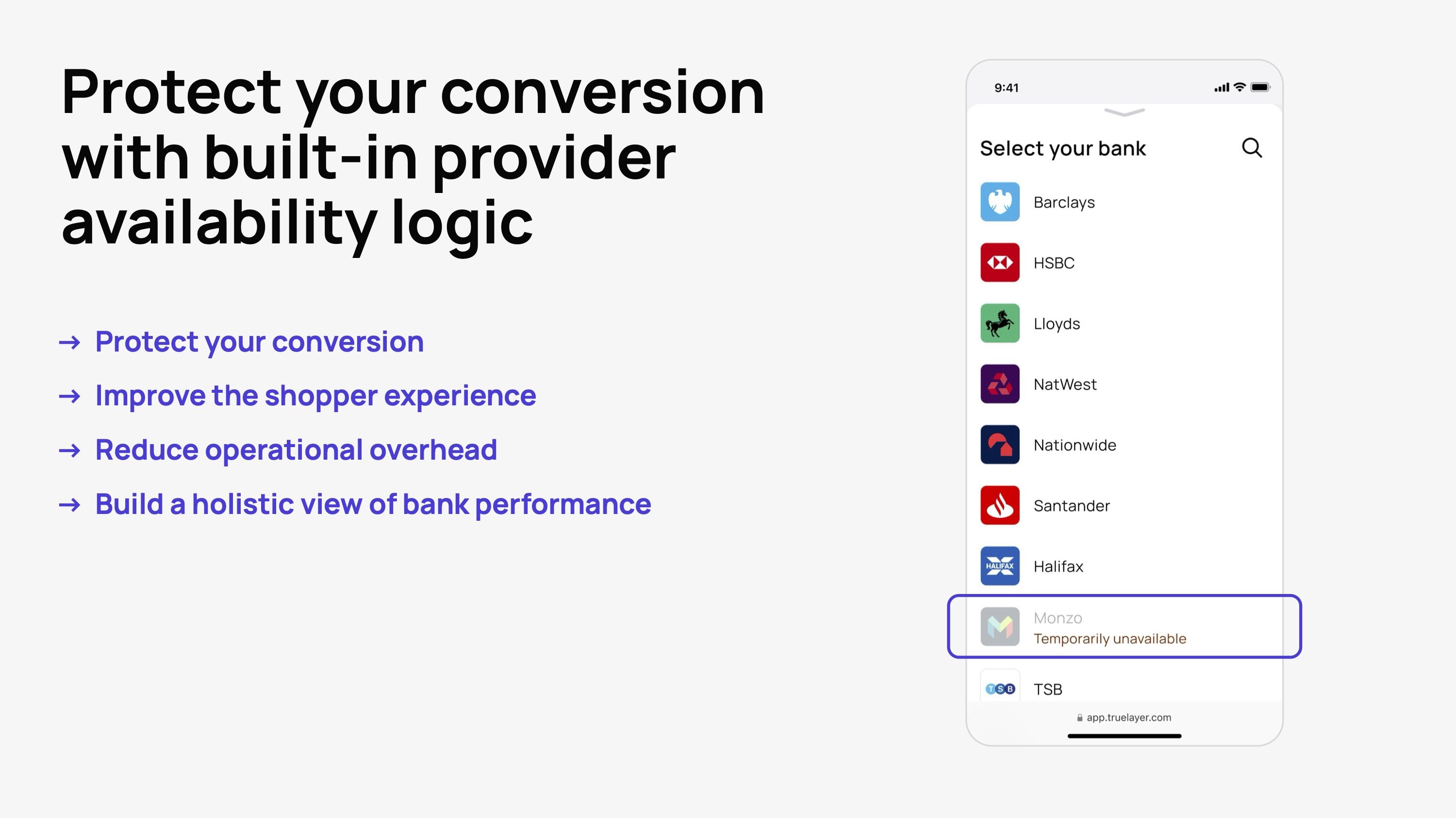
Provider availability logic
Pay by Bank offers a reliable and secure payment experience, but the bank apps required to make a payment do occasionally suffer issues or downtime. One TrueLayer feature that helps mitigate this is our provider availability logic. This feature allows you to automatically hide a specific bank from your payment selection screen when it's experiencing downtime.
Speak to a Pay by Bank expert
TrueLayer is Europe’s largest Pay by Bank provider, processing over $100 billion worth of payments each year. We power smarter, faster and safer payments online and in-app. We work with the likes of Just Eat Takeaway, Ryanair, lastminute.com, Papa Johns and more to offer Pay by Bank as a payment method in some of the world’s busiest online checkouts.
Get in touch with us
)
Bank on File is on the launch pad
)

TrueLayer appoints Stefano De Lollis as Head of Ecommerce
)
